

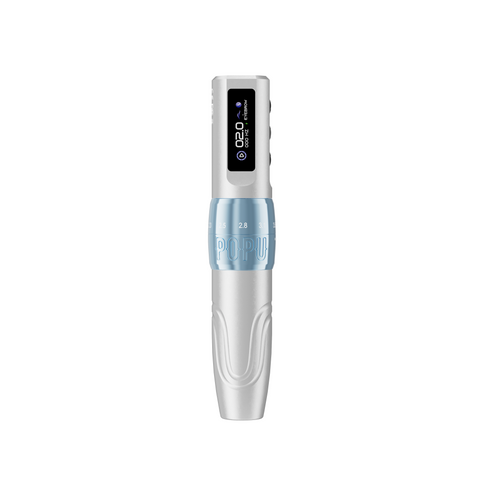
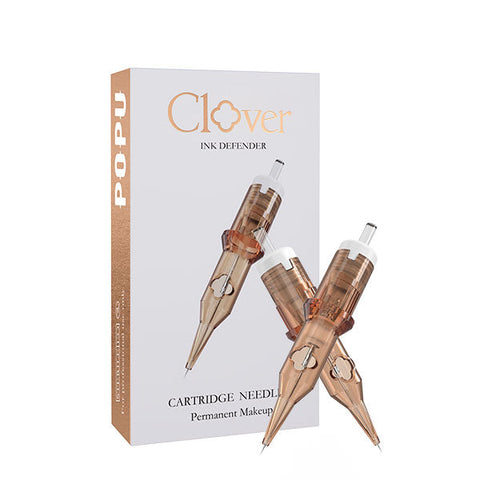
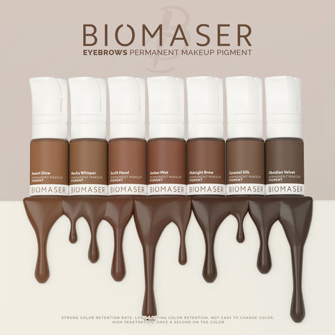

Start with three decisions when you buy colour. Choose a product documented for the intended use. Choose the shade by its role in the design, such as a medium neutral brow body or a muted eye shadow. Then choose its listed opacity and supporting colour. For a medium neutral brow, start with Blend Brown Coffee BPE02 and add Light Brown BPE01 for the lighter transition. Both are medium-opacity shades. That pairing lets the front read lighter while the body keeps its intended depth, with one purpose for each bottle.
Chemistry helps explain why two colours that look similar in a cup can cover differently and change differently over time. A Colour Index identifier helps you identify a constituent. Particle size and refractive index help explain optical behavior. A lightfastness result tells you how a tested material behaved under stated conditions. The finished bottle, its intended use and its current documentation remain the basis of a purchase.
On this page
- Start with the finished formulation
- Organic and inorganic pigment chemistry
- Read Colour Index identifiers and product documents
- Particle size dispersion and carrier behavior
- Opacity refractive index and visual depth
- Lightfastness and colour change over time
- Choose a palette around the work
- Compare swatches and supplier information
- Pigment chemistry and purchasing FAQ
Start with the finished formulation
Separate a pigment particle from a finished ink
A pigment generally provides colour as dispersed particles. A dye generally provides colour in dissolved form in the medium where it is used. Studio language often calls the finished bottle a pigment. Chemically, that bottle is a formulation. It can contain one or more colourants, a carrier and other components that support dispersion, consistency or preservation. A raw pigment identifier describes a piece of that formulation. The finished product determines how those pieces reach the cup and behave together.
This distinction matters when you compare a standalone yellow with a tan that uses yellow as one contributor. The same colourant can serve different roles in the two formulations. The yellow bottle could be a clearly yellow accent, while the tan might use its yellow contribution alongside other colours to arrive at a particular warmth. A shared constituent does not erase those visual or functional differences.
Define what you want the formula to do
Write the colour decision in ordinary studio terms. For example, a brow body needs a medium neutral brown, an eye design needs a clearly visible darker line alongside a softer shadow, or a lip study needs a defined red centre within a mauve outer field. Each brief gives the formula a job. Compare choices that serve that job at roughly the same depth before judging which one has the preferred temperature or opacity.
A working palette can be small when each bottle fills a distinct role. A main medium shade, a lighter transition and a deeper anchor often offer more useful choices than several shades clustered around the same visual depth. A studio serving several techniques may still need separate sets because colour behavior and suitability depend on the finished formula and its intended use.
Read intended use before colour family
Tattoo ink and PMU colour can share chemical families. Buy the finished product for its documented purpose. ATTO's Thunderlord Power practice tattoo inks are for synthetic practice skins and models only. Their colours can teach value, spacing and contrast on those materials. Blend PMU shades serve their documented PMU roles. Keep the two workflows clearly separated so a convenient practice bottle never enters a client palette.
Organic and inorganic pigment chemistry
Organic families include several kinds of molecular structure
In pigment chemistry, organic refers to a broad set of compounds with carbon-based molecular structures. Colour arises in part from how the molecular structure absorbs portions of visible light. An azo pigment contains an azo linkage between nitrogen atoms within its chromophore system. Other organic families use different structures. A phthalocyanine, for example, has a large ring system and can have a central metal. These examples show why the word organic alone gives little guidance about hue or light behavior.
The colour family visible on the label tells you the intended appearance of the bottle. An ingredient identity tells you what one constituent is. Use both when available. A formula can use several constituents to arrive at a single red, brown or violet appearance. Its visual character belongs to the finished combination.
Lakes use a different route to an insoluble colour
A lake pigment generally starts with a dye associated with an insoluble substrate or converted into an insoluble colourant system. The point is to make colour available as a particulate material that can be dispersed. The label lake describes a type of colourant preparation. Look to the disclosed identity and finished product documents for the actual constituent and intended application. The term by itself supplies no useful prediction of opacity, lightfastness or the appearance of a particular shade.
Inorganic pigments include oxides and other materials
Iron oxides can supply red, yellow, brown and black contributions depending on the chemical form and combination. Titanium dioxide is a white pigment known for strong visible light scattering and can be used to increase lightness and hiding power. Carbon black is a particulate elemental carbon pigment associated with broad visible absorption. The latter is a useful illustration of the difference between carbon-containing organic molecules and elemental carbon. A product label and supplier documents provide the place to check whether any of these constituents are present in a specific shade.
| Pigment example | Chemical or structural distinction | Typical visual contribution | Purchase evidence to request |
|---|---|---|---|
| Azo colourant | Azo linkage within a molecular colour system | Some red, orange or yellow directions, depending on identity | Exact constituent and finished shade documentation |
| Phthalocyanine | Large ring system, commonly with a central metal | Some blue and green directions | Exact constituent and intended-use documentation |
| Lake pigment | Dye-based insoluble colourant preparation | A hue associated with the specific dye and preparation | Disclosed identity and applicable product documents |
| Iron oxide | Inorganic iron oxide or related oxide form | Red, yellow, brown or dark contributions | Declared identity in the exact product |
| Titanium dioxide | Inorganic white material with strong scattering | Lightening or hiding power in a formulation | Declared identity and finished opacity description |
| Carbon black | Particulate elemental carbon | Dark visual contribution through absorption | Declared identity, exact use and finished product documentation |
Treat hybrid as a description to clarify
A supplier may use hybrid to describe a palette or a formula that brings together organic and inorganic colourants. Ask what the term describes in that range. A name may refer to the range's positioning, while each shade has a different set of ingredients. Product-level documents are the right place to establish what you are buying. A study of PMU colourants identified both organic and inorganic pigments among the products examined. The categories organize ingredients and help frame more specific questions about the finished formula. PMU pigment identification study
Read Colour Index identifiers and product documents
Use a CI identifier to identify the colourant
A Colour Index reference gives a common language for discussing a colourant across products. Generic names and constitution numbers may appear in different forms. For example, CI 77891 is associated with titanium dioxide and CI 77266 with carbon black. The presence of a number can answer an ingredient identity question. It cannot tell you the concentration, dispersion quality or carrier in that bottle by itself. Two products listing the same CI can have different opacity, handling and visual roles.
Start with the label for the exact shade. If you need to compare formulas, ask for the applicable ingredient information, safety data or instructions from the responsible supplier. An SDS serves hazard communication and may disclose ingredients according to its own requirements. For a complete ingredient question, use the relevant label or a written statement tied to that product as well.
Read the documents by purpose
| Document or field | What it helps establish | Practical check | What to compare across suppliers |
|---|---|---|---|
| Product label | Identity, intended use and supplied directions | Match the name and shade to the bottle in hand | Exact use and responsible supplier |
| Ingredient or CI information | Declared colourant identity | Keep the disclosed constituent linked to the right shade | Shared or differing constituents where disclosed |
| SDS | Hazard communication for the supplied product | Check that its scope and version match the product | Relevant hazard and handling information |
| Instructions for use | Preparation, handling and other supplied directions | Read the directions for the exact format | Whether the instructions fit the station workflow |
| Lot and date markings | Batch identity and date information on the bottle | Match the bottle and pack when receiving a reorder | Availability of traceable replacement stock |
| Supplier statement | Answer to a defined composition or documentation question | Ask for product, shade and scope to be identified | Whether the answer resolves the question you actually asked |
Compare documents at shade and lot level
If a studio changes its main colour, keep the existing and candidate shade names distinct while you compare them. Use the supplied documents for each exact product. If you reorder the same shade, check that the delivered bottle matches the order and retain its traceable lot information as part of normal studio practice. That helps you identify which bottle was used if a supplier later asks about a production issue.
For formulas intended for multiple markets, request the documentation relevant to the destination and intended use. ATTO lists its Blend PMU pigments as EU REACH compliant. The applicable scope belongs to that finished product line. The presence of the same CI in another bottle does not establish the same market documentation. Choose the shade for the brief and keep the product evidence tied to the purchase.
Particle size dispersion and carrier behavior
Distinguish primary particles from groups of particles
A primary particle is one constituent particle. Particles may sit together in clusters in the material as supplied or in the carrier. A specification could describe individual particles or the effective distribution measured in the finished suspension. Ask which is measured before comparing size claims. A single average may also hide a wide distribution. Two materials with the same average can contain very different fractions of smaller and larger particles.
Size matters because it can affect both scattering and suspension behavior. It works alongside shape, density, refractive index, the carrier and the degree of clustering. A smaller claimed size by itself gives no usable ranking of opacity. Compare the complete formula's documented shade role and a controlled swatch when those are the decisions in front of you.
Understand how the carrier affects what reaches the cup
A carrier is the medium in which the particles are dispersed. Depending on the formula, a product may use water and other components to achieve the intended handling. Dispersing and stabilizing ingredients can help the suspension behave consistently during normal use. Some suspended particles may settle over time. Follow the preparation directions for the exact product. The Blend product directions call for thorough shaking before dispensing.
Dispense each shade into a separate suitable cup when you compare colours. A small residue from a darker shade can materially change the first impression of a light transition. If two dispensings from the same bottle look different, review preparation and the cup before drawing a conclusion about the colour. Compare fresh portions under the same lighting. When the difference persists, the exact bottle and lot are useful information for the supplier.
Compare format and application together
A free-flowing dispersion and a viscous paste serve different handling needs. A fluid format can suit a documented machine workflow, while a paste can be designed to stay where it is picked up during a documented manual workflow. The form affects how the colour is prepared and delivered. Compare products by the application described for each format before drawing conclusions about the chemistry from how thick they feel.
Two samples that look equally brown can still be poor substitutes if their directions are for different methods. Start with the exact format and intended application, then compare colour and opacity within that group. Where the same shade name appears across formats, use the package directions for the bottle in hand.
Ask what the particle measurement actually represents
A particle size claim becomes more useful when it identifies the material measured, the method and the units. An image-based count can emphasize what the chosen image resolves. A method that estimates a distribution in suspension can respond to clusters and to the assumptions behind the method. Check that two numbers describe comparable material and conditions before using them in a purchase decision. If one describes raw powder and the other describes a prepared suspension, the differences may reflect the measurement as much as the pigment.
Opacity refractive index and visual depth
Separate what the colour looks like from how it covers
Value describes how light or dark a colour appears. Opacity describes how strongly it hides the background in the conditions of a comparison. A light colour can cover strongly. A dark colour can contribute noticeable depth while still allowing the surface below to influence the view. First decide how light or dark the target area should appear. Then decide how much the background should remain visible. A border can appear conspicuous even when its opacity category seems modest if the contrast with the adjacent field is strong.
Relate absorption and scattering to the appearance
Light entering a pigment layer can be absorbed or redirected by particles and their surroundings. Selective absorption shapes hue. Scattering changes how much light returns and how strongly the layer hides the material beneath it. The refractive index contrast between particle and medium influences scattering, along with particle geometry, particle size, wavelength and spacing. Titanium dioxide illustrates the role a strongly scattering white material can play in lightening and hiding. The surrounding formula determines how that contribution appears in the finished colour.
A relatively thin swatch may leave more of the background visible. A thicker layer changes the light path and how many particles it encounters. Dispense and compare equal preparations when judging shade differences on a synthetic surface. A second study with varied layer thickness can demonstrate how coverage changes, while the first comparison remains a fair comparison of the bottles.
Check depth and opacity as separate purchase decisions
| What you want to decide | Keep constant | Compare | Useful result |
|---|---|---|---|
| Which shade looks lighter | Surface, view and approximate swatch thickness | Two shades in the same opacity category | A choice between lighter and deeper visual roles |
| Which swatch hides more of its ground | Surface contrast, lighting and swatch method | How much of the marked background shows through | Relative coverage on that test surface |
| Which shade looks warmer | Approximate value and opacity category | The direction of each shade against a neutral reference | A temperature choice with similar depth |
| Whether a higher opacity is useful | Outline and target area | A matched reference area with different hiding | Whether a defined accent would overwhelm the design |
| Whether a different formula belongs in the palette | Intended use and visual task | Documented shade and actual synthetic comparison | A choice tied to the work |
Lightfastness and colour change over time
Read lightfastness as a defined test result
Lightfastness is resistance to colour change under a given light exposure. Identify the material, medium, exposure and comparison. A raw pigment can behave differently in a different medium or in a mixture. A printed swatch, an illuminated solution and an implanted pigment exist under different conditions. Research on selected tattoo colourants found different responses to light in vitro across the substances tested. This illustrates why the exact identity matters and why an exposure result belongs with its test conditions. Experimental pigment photostability study
Distinguish exposure studies from appearance in skin
Skin changes how light reaches and returns from pigment. Surrounding tissue, depth and particle distribution all influence what you see. Appearance also changes as the site heals. Compare photographs taken under similar lighting and at comparable stages. A warm cast in one picture can come from the lamp or camera rendering. A change visible in the actual healed work under matched conditions deserves a different interpretation from a change visible in only one photo.
Human tissue research has found selected tattoo pigment constituents in skin and regional lymph nodes. An animal model examined transport and light-associated change in a particular pigment. These findings distinguish physical distribution from chemical change as research questions. Apply each to the materials, samples and conditions examined. Human tissue mapping study · Experimental animal study
Explain unequal colour change without guessing a mechanism
A mixed shade looks the way it does because several components and the viewing background contribute to the result. If those contributions change by different amounts, the remaining colour can shift in direction. A brown might look warmer or cooler after the relative balance changes. To evaluate the shift, start with comparable photographs and the original product. For a new colour plan, assess the actual residual colour, intended value and appropriate scope of work.
Keep the appearance question separate from a health question. An unexpected skin change or reaction calls for appropriate clinical evaluation. Laser response is also a separate clinical question requiring assessment of the particular case.
| Observation | Compare first | Evidence that changes the interpretation | Practical next step |
|---|---|---|---|
| One photo appears warmer | Lighting, camera and an actual view | Difference vanishes under matched conditions | Use a consistent comparison before changing palette |
| A healed colour differs from the fresh view | Comparable review stage and actual appearance | Change remains visible in matched views | Assess the resulting colour and review the original product |
| A swatch fades in a controlled exposure | Same formulation and method | Repeatable difference between samples | Compare only the stated exposure conditions |
| Research detects particles outside the original site | Material and experimental method | Tissue measurements of selected constituents | Keep the finding tied to the study |
| Residual pigment differs after earlier work | Hue, value and work history | Professional assessment of the case | Choose an appropriate colour plan or refer as needed |
Choose a palette around the work
Build a neutral brow pair by depth
Start with Brown Coffee BPE02 for the main medium neutral brown. Add Light Brown BPE01 for lighter transitions. Both have medium listed opacity, which makes them useful for comparing depth within the same category. If the brief calls for a deeper neutral accent, add Warm Coffee BPE06. Its colour direction is neutral in the Blend range despite the name, and its listed opacity is high. Buy it for a stronger accent while the medium shade continues to carry the body.
Use the lighter and medium bottles to demonstrate two zones on a synthetic guide. Compare the front and body under the same light. The exercise lets you judge where the change in depth becomes visible before deciding whether a third colour belongs in that palette. Review the pattern from a normal viewing distance. If the lighter marks look disconnected, compare a more gradual arrangement of the same two shades before ordering a third bottle to bridge the gap.
Choose an eye line and eye shadow separately
For a dark brown line, start with Ink Brown BPB02, a gray-based dark brown with high listed opacity. Pair it with Fragrant Brown BPL07 eye shading when you want a softer muted nude-brown field. These shades serve separate visual jobs. Start with the liner bottle alone if the design uses one clear line. Buy the pair when the shadow needs its own direction and coverage.
To compare those roles on a synthetic eye guide, keep the fine line steady and place a short shadow area beside it. View the whole design before examining the edge close up. If the shadow competes with the line, compare a smaller field first. If the field fits and still has too much visual weight, choose a more restrained shade direction for that field.
Build a lip palette around the main field
For a cool rose-led mauve field, choose Mauve Pink BPL05. Add Inner Lip Red BPL11 when a redder centre belongs in the design. Both carry medium listed opacity. Start with one bottle for a uniform mauve field. Order the pair for a deliberately graduated composition. For a peach-pink direction, compare Pink Orange BPL03 in its own study before moving it into a different palette.
| Design decision | Main shade | Supporting shade | Reason to add it |
|---|---|---|---|
| Medium neutral brow with a light front | Brown Coffee BPE02 | Light Brown BPE01 | A lighter transition within the medium-opacity category |
| Medium neutral brow with deeper accents | Brown Coffee BPE02 | Warm Coffee BPE06 | Deeper neutral definition and higher listed opacity |
| Dark brown eyeliner with a muted shadow | Ink Brown BPB02 | Fragrant Brown BPL07 for eye shading | Distinct high-opacity line and medium-opacity shadow roles |
| Mauve lip field with a redder centre | Mauve Pink BPL05 | Inner Lip Red BPL11 | Separate hue directions within the medium-opacity category |
| Peach-pink lip field | Pink Orange BPL03 | Add a documented companion for a defined second role | One 12 mL bottle covers the first study of that direction |
Compare swatches and supplier information
Use a swatch to answer one optical question
Prepare two small swatches on the same synthetic surface and use the same light. For a depth comparison, use a common neutral background and compare both at the distance from which you view the whole design. For a coverage comparison, carry both over the same simple contrast marker and inspect how much of it remains visible. For a transition comparison, put each candidate beside the main shade using the same area and boundary. Keep those exercises separate so a larger field or darker background does not take over the comparison.
A synthetic swatch shows the relative appearance of those samples under the chosen conditions. Keep it with the training materials as a colour reference. To compare actual healed appearance, use the studio's established review process with consistent photographs and the appropriate professional assessment.
Ask suppliers questions that have specific answers
Ask for the exact shade identity, intended use and relevant product documents before expanding a studio palette. If the question is about a CI number, request the disclosed ingredient for that shade. If the question is opacity, request the documented category and intended visual role. If the question is particle size or lightfastness, request the measured material and conditions. A single broad description rarely answers all four questions.
Buy a main colour and one clearly different companion before filling every shade slot. The Blend examples above are each supplied as one 12 mL bottle. For a training station, use individual compatible pigment cups for each colour and keep synthetic practice products separate. Move from the depth and opacity comparison to the role you need in the palette.
Pigment chemistry and purchasing FAQ
Does organic mean natural?
Organic in pigment chemistry describes a broad group of molecular compounds. Ask for the actual constituent and documented use of the finished product. For a purchase decision, the exact shade's formulation and intended role are the useful points of comparison.
Which family has higher opacity?
Compare the finished shades. Opacity depends on absorption, scattering, particle properties, concentration and the application conditions. A light shade can hide strongly while a darker shade can make a visible colour contribution with less hiding.
Can two formulas with the same CI behave differently?
Yes. A shared CI identifies a declared constituent. The amount, other colourants, dispersion and carrier can vary. Compare the intended role and finished product documentation.
What does a single particle size number tell me?
It describes the measurement as reported. Ask whether the value describes primary particles, a distribution in suspension or a different sample. Read the method and units before comparing two claims.
Does lightfastness predict how long a PMU shade will look the same?
A lightfastness result applies to the tested material and exposure. Compare healed appearance under similar viewing conditions, and use the documented colour role for buying decisions.
Which Blend pair should I order for a first neutral brow palette?
Choose Brown Coffee BPE02 and Light Brown BPE01. Brown Coffee carries the medium body and Light Brown gives the front or transition a lighter role. Add Warm Coffee BPE06 when deeper neutral definition belongs in the design.
Do I need a separate pigment for liner and shadow?
Choose separate shades when you want a clearly defined dark line and a softer field with its own hue. Ink Brown BPB02 and Fragrant Brown BPL07 are one documented pairing for those distinct roles.
Can I buy a practice tattoo ink and use it in PMU?
Use the Thunderlord Power practice inks on synthetic practice skins and models. Order documented PMU shades for the appropriate PMU work and keep the two supplies separate at the station.
What should I ask for if I want to compare two suppliers?
Ask for the same evidence from both for the exact shade and intended market. Start with the product label and intended use, then add ingredient or CI information and the relevant safety or application documents. Compare the same visual role with a controlled swatch where appropriate.