


A soft brow can still have a clear shape. In a powder design, the shape comes from the distribution of value across the brow rather than a series of individual hair-like lines. An ombré design emphasizes a visible gradient. A combination brow adds selected hair strokes where the design benefits from them and uses a powder field where it needs continuity. These approaches often share a set of tools. The choice starts with where the client wants definition, where they want softness, and how their native hair contributes to both.
This guide takes the design through a consultation, an actual-size map, cartridge and workstation selection, a synthetic training progression, and a professional review. Synthetic exercises teach motion and visual control. Live procedures require qualified supervision, infection controls, and assessment of the individual client. FDA tattoo and permanent makeup safety
Contents
- Three design choices
- Consultation and value mapping
- The front body and tail
- Pixel spacing and pendulum practice
- Cartridge geometry and selection
- Machine and workstation choices
- Plan the hybrid junction
- Real studio briefs and academy exercises
- Troubleshooting and healed review
- Frequently asked questions
Three design choices
Powder describes a field
A powder brow uses a visually connected field that can resemble the appearance of softly applied brow makeup. The field can be light or pronounced. Its defining design question is where a connected value area helps the brow read. A client might ask for a stronger body because natural hair is sparse there, while their front already has plenty of presence. A lightly connected field can bridge the body without giving the same weight to every zone.
Ombré describes the transition
An ombré treatment makes the difference in value or apparent density part of the design. A familiar example is a front that reads lighter and a tail that reads more clearly. The transition can also vary between the upper and lower edges depending on the intended look. Draw two or three value bands on paper, then soften the join visually. If the brow reads as separate blocks at conversational distance, the transition needs work before any tool decision.
A combination brow gives two treatments distinct jobs
A hybrid might reserve open hair-like marks for the front while a soft field gives the body continuity. It can also use hair-like detail in a limited gap within a broadly shaded design. The important question is whether the added marks remain visible and support the shape. If the same area is already dense enough, adding a second treatment can reduce the separation that made the first one readable. Sketch both treatments on separate layers before showing the combined proof.
| Design brief | Main visual structure | Edge to protect | What to inspect at normal distance |
|---|---|---|---|
| Powder | Connected soft field | Upper and front boundary | Does the shape read without a hard perimeter? |
| Ombré | Progression from lighter to more defined | Transition between zones | Does the gradient read as one continuous brow? |
| Combination | Hair-like marks plus a tonal field | Junction between both treatments | Can the strokes still be distinguished where they matter? |
| Sparse local fill | Targeted correction to the sketch | Native hair direction | Does the small adjustment solve the visible gap? |
Consultation and value mapping
Ask what the client means by soft
The word soft can refer to a light shade, a feathered edge, an airy front, or a brow that reads naturally in relation to the rest of the face. Ask the client to point to the feature they like in an example. One client may be talking about the front edge while another is talking about a lighter overall brown. The distinction changes the design. A light shade within a heavy shape can still read graphic, while a clearly defined body can look soft if its front remains open.
Observe the native contribution
Look at the client's brow with a relaxed face, then review its usual expression and viewing angles. Note where existing hair supplies value, where the skin between hairs is especially visible, and where the shape ends. A sparse body can need continuity even when the tail looks strong. Conversely, a full body can make an overly dense head look out of place. Use the actual brow as a reference instead of transferring the same light-to-dark pattern to everyone.
Review previous color as its own variable
Existing PMU can influence whether new marks will remain visually distinct. Photograph or view the area consistently where the client's consent and professional procedures allow. Identify how much weight the old field already carries and where its edge sits. Discuss any mismatch between that field and the proposed shape before deciding on a new design. Follow the studio's screening and referral process for concerns outside its scope. A new cartridge cannot create visual separation where the background already reads as one dark field.
Show two proofs with one deliberate difference
Make a light, diffused proof and another with a more defined body or tail. Keep the same outer shape so the client can focus on the value change. If the issue is the outer boundary, keep value constant and show a softer edge instead. One change per comparison makes the client's preference easier to identify. Review the proofs at the distance at which the client usually sees their brows, then inspect the critical transitions close up.
Separate the shape the client chose from the effect the artist performs
A consultation can finish with agreement on the outer shape while leaving the transition unclear. Ask the client to approve one specific visual change in each region. At the front, that might be a gentler entry into the brow. At the body, it might be enough definition to join two visible patches of hair. At the tail, it might be a shorter finish that still reads clearly. Then check the combined proof at conversational distance. A full shape with three visible jobs gives the studio a better reference than a request for general softness.
Give the instructor or colleague a useful handoff by showing the approved proof and the exact transition that deserves attention. Compare it with one rejected proof that makes the difference clear. If the selected design relies on an open front, the demonstration can focus on the first part of the gradient. If it relies on a clean hybrid join, the field and stroke layers can be taught separately first. The design remains the same while the bench exercise isolates the skill that will help the artist achieve it.
The front body and tail
Front: preserve the soft entrance
The front establishes how the brow begins on the face. Give the eye enough space to see a transition from skin to brow. If native hair is already distinct there, use it to carry part of the shape. In a paper proof, compare a front with a light cluster against a front drawn as a continuous vertical edge. The difference is often visible before any change in color. Keep the option that matches the client's desired openness.
Body: build continuity without creating a strip
The body needs enough connected value to bridge gaps and carry the shape. It can lose that quality if the value is too sparse in the middle, or it can turn into a strip if the upper and lower edges have equal weight. Draw the body using a restrained edge and a distinct center of value. Compare it with a uniformly filled version. The first design often gives the artist more freedom to preserve native hair and a soft boundary where those are important to the brief.
Arch: turn the shape and the gradient together
At the arch, the direction of the brow and the distribution of value need to agree. A sharp dark patch at the highest point can make the brow look peaked even when the outer drawing has a gentle turn. Move the strongest part of the design slightly away from that point on the proof and review the effect. The best place for weight follows the client's structure and the intended style. Keep the transition visible through normal expression before committing to the map.
Tail: define the endpoint while preserving taper
A tail may need a clearer finish, especially if hair becomes sparse toward its end. A compact visible edge can help. Avoid treating the entire tail as a single solid mark in the proof. Look for a path from the fuller body through a narrower section to the endpoint. A small grouped liner can be a candidate for a precise boundary exercise, while a shader may fit the tonal passage inside the tail. Compare the shape before choosing which geometry belongs there.
| Zone | Visual priority | Common proof problem | Revision to compare |
|---|---|---|---|
| Head | Gentle entry and openness | Vertical wall of value | Separate the first cluster and lighten the edge |
| Front body | Smooth connection | A visible band between light and dark | Spread the transition across a wider drawn area |
| Center | Continuous shape | Uniform dark strip | Preserve a quieter upper edge |
| Arch | Direction change with balance | Dark spot at the highest point | Shift the strongest value within the shape |
| Tail | Visible endpoint and taper | Bulky tip | Narrow the last shape and remove extra boundary weight |
Pixel spacing and pendulum practice
Treat pixels as a visual unit
In PMU education, pixel shading commonly describes an effect built from small marks that read together at a normal distance. On synthetic material, you can inspect whether the individual marks remain separate, bunch together, or form an unintended band. The visual field depends on size, spacing, overlap, and value. Change only one factor in a demonstration. Keep the shape and reference constant so students can see why two fields of similarly sized marks can read differently.
Use a pendulum exercise to observe motion
Pendulum describes a swinging movement taught in some shading approaches. On a flat trainer, an instructor can demonstrate the direction of travel and where a learner loses control as the motion changes. A short repeated arc is easier to observe than a full brow. Ask the learner to compare the beginning, the middle, and the end of their synthetic mark. Look for a dense stop, a break in the transition, or movement that crowds an adjacent line. A qualified instructor can evaluate how a method applies to live work. The bench exercise does not specify a live angle, speed, voltage, or depth.
Compare gradients in a shape that matters
Use a practice shape that narrows toward one end. An open rectangle can conceal how a wider cartridge behaves near a boundary. Draw three intended value regions with overlapping transitions. Review the result at actual brow size and check the area where the field meets the narrow tail. If a hard band appears at the transition, compare the spacing and the planned boundary before changing the machine. The goal is to understand which variable creates the band.
Distinguish the view under magnification from the whole design
A close-up can show individual points and uneven spacing. At a normal viewing distance, the same marks contribute to a field. Take both views when assessing a synthetic exercise. A student can achieve even points up close while creating an abrupt front in the full design. Another can create a pleasing full field with a small area that needs closer technical feedback. Decide which view answers the question being assessed before giving a score.
Cartridge geometry and selection
Start with a single point for isolated detail
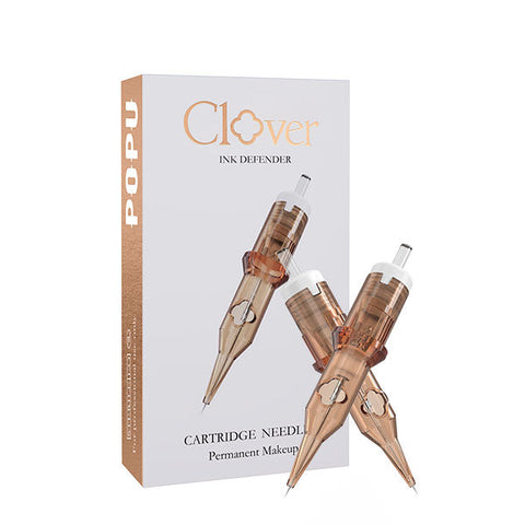
The Pinky Pro 0601RL, 20 cartridges uses one 0.20 mm point. It gives an educator a useful reference for a discrete accent or a narrow open area. For a combination design, place the intended mark on the map first. If the area already reads full, the single point can be technically capable of making another mark while the design has no need for it. Keep the geometry tied to the job.
Compare grouped liners for defined features
The Pinky Pro 0403RL, 20 cartridges uses three 0.18 mm points arranged as a compact liner. Each point is narrower than the wire in the 0601RL, yet the assembled grouping has a different footprint. Use the grouped comparison where the brief needs a more defined edge and has room for it. A grouped liner can help teach the difference between point diameter and working geometry on the same drawn shape.
Use a compact round shader for coverage with room
The Pinky Pro 1003RS, 20 cartridges uses three 0.30 mm points in a round shader configuration. Its more open footprint makes it a useful candidate for a compact tonal passage. Compare the widest part of the planned body with the narrowest part of the same region. If the group fits the body and crowds the boundary, assign it to the wider passage and keep a smaller compatible choice for the edge exercise.
Confirm a U-shaped row before adding it to a course
A U-style grouping can present a curved working edge in a row layout. A code such as 11U gives a count and a family label. It does not establish exact wire diameter, working width, or grip fit across catalogs. Add a U-shaped option when the curriculum has a coverage exercise that takes advantage of its profile. Ask for the exact variant and layout documentation before buying course quantities. Keep the single point and compact shader as the simpler first purchase if those are the two geometries students need for their initial exercises.
| Option | Known geometry | Job to compare | Buy when |
|---|---|---|---|
| Pinky Pro 0601RL | One 0.20 mm point | Discrete accent or narrow isolated mark | The brief repeatedly needs a fine detail |
| Pinky Pro 0403RL | Three 0.18 mm points, compact liner | Defined edge with room for a grouped footprint | The course or studio has a distinct contour job |
| Pinky Pro 1003RS | Three 0.30 mm points, round shader | Soft compact coverage | A tonal region recurs in appointments or lessons |
| Compatible 11U family | Eleven-point U arrangement where verified | A wider directional coverage exercise | The exact width and interface fit an established task |
Machine and workstation choices
Choose a fixed setup for repeated demonstration
The Black TP010 Kit brings a fixed-stroke pen, spare battery, and starter supplies to a new station. It is a useful first setup for a course that teaches the same mark repeatedly across benches. With a consistent machine and compatible grouping, the instructor can focus feedback on the visible motion and the design instead of managing a different collar position at each bench. Review the kit contents against the course list before ordering dedicated refill boxes.
Use adjustable travel when the course teaches response
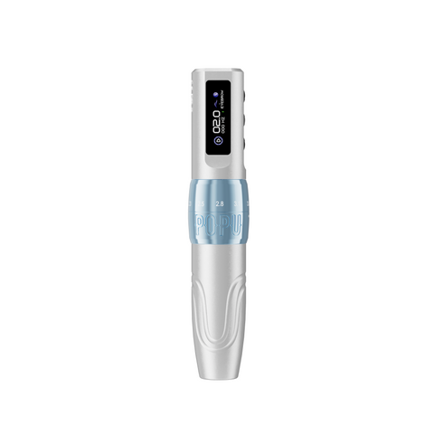
The Black dual-battery U1 has six stroke positions spanning 2.0–3.5 mm. The adjustable pen gives the educator a way to demonstrate mechanical response with the same handpiece and compatible cartridge. Set up one exercise in which the only intended change is mechanical stroke. Repeat it on the same model. Let learners compare the shape and visibility of the result, then describe the difference in feel. Mechanical stroke measures drive travel. Projection, hand motion and penetration are separate concepts.
Budget the spare around actual handoffs
A spare battery has a clear use when a handpiece moves between a demonstration and successive student exercises. A full room can lose class time if a charger is shared and the next machine has no charged spare. Plan where charging happens and when the instructor can exchange batteries. For an existing station with a well-tested compatible pen and enough charged power, the next purchase may be dedicated liners and shaders. Upgrade the machine when adjustable travel or a consistent new station solves a recurring problem.
| Setup | What it gives the bench | Best fit | Practical check before purchase |
|---|---|---|---|
| TP010 kit | Fixed-stroke pen, spare battery and starter supplies | Standardized introductory exercises | Compare included contents with class requirements |
| Dual-battery U1 | Adjustable 2.0–3.5 mm range and spare battery | Response comparisons or mixed training tasks | Confirm exact cartridge fit and charging arrangement |
| Existing compatible pen | Familiar handling and teaching routine | Course already runs smoothly | Verify whether dedicated consumables solve the immediate need |
| Shared instructor station | One common demonstration setup | Small group with staggered bench work | Plan charge and access during the session |
Plan the hybrid junction
Draw strokes and tone on separate layers
Lay the planned hair strokes over the client map on one transparent layer. Put the powder field on another. Review the hair layer by itself, then add the field. If the defining strokes disappear at the join, reduce the value in the background or move the starting point of that field. If the two treatments leave an abrupt gap, extend the visual transition while keeping the front's open space. This comparison shows where each treatment needs to contribute.
Use a join with room for both treatments
A brow that has native direction in the front and a large sparse area in the body can be a good design case for a visible join. The natural front can carry a few selected marks while tone supports the wider body. Put the transition where the brow has enough space to soften it. If both treatments compete for a narrow strip, decide which contributes most to the silhouette. An informed map gives the educator a clear place to assess whether each geometry fits.
Decide when to simplify to one treatment
A client might like hair strokes in a reference photo and prefer a soft continuous shape on their own face. A separate stroke layer may add complexity without producing a visible difference at normal distance. Show a powder-only option and a combination proof with the same shape. Discuss which detail the client can see in both. If the distinct stroke adds no value, a single treatment can serve the brief and simplify the choice of equipment.
Real studio briefs and academy exercises
A light front with a defined body
A client says the current brow looks too abrupt at the front, yet likes the body and the overall depth. Prepare two versions with the same outer shape and pigment role. Give one a broad transition into the body and keep the other more defined. Ask the client to point to the feature that changes. A learner can reproduce the approved proof on the ATTO A4 hair-stroke practice sheet and compare how the front reads from close up and at normal distance. The exercise should make the change in spacing visible while keeping the same overall shape.
A patchy center with a clear tail
Another client thinks the tail needs a darker color. At normal viewing distance, the real interruption appears in the middle where hair is sparse. Show a map with a stronger tail and another with a connected center and the original tail. If the latter restores the shape, reserve the extra weight for the gap. For a synthetic demonstration, compare the small round shader through the relevant passage. A wider group earns consideration only when its edge fits the mapped shape. Use the approved placement and role to choose the tool.
A course with one instructor and multiple levels
Begin with a paper exercise that asks everyone to draw the same gradient and preserve a visible opening at the front. Move to short synthetic segments before a complete brow. Introductory students can work with one compatible shader and the same shape throughout. Advanced students can compare the transition on two shapes or choose a distinct fine-point accent for a hybrid. The instructor can score the resulting fields using the same criteria while tailoring each exercise to the learner's stage. Plan the order of the work so a single demonstration station stays available.
| Exercise | Material or proof | Review criterion | Advance when |
|---|---|---|---|
| Two value regions | Paper at actual size | Clear planned light and dark roles | Learner can name where the transition belongs |
| Short pendulum observation | Flat synthetic material | Visible control of start, turn and finish | Several short arcs remain comparable |
| Narrowing tonal shape | Synthetic brow outline | Coverage fits without a dense terminal patch | Tail and body remain distinct in the whole view |
| Two-layer hybrid proof | Transparent or digital drawing layers | Hair marks remain readable where needed | Learner can explain the junction and remove an unnecessary mark |
| Complete synthetic brow | Actual-size model | Front, body and tail read as one design | Review confirms the intended gradient and edges |
Troubleshooting and healed review
Start where the issue first appears
If the hard front is already in the paper drawing, revise the sketch before comparing cartridges. If the proof has a smooth gradient and the synthetic exercise shows a band, examine the start and end positions of neighboring passes. If the design looks clear on a flat sheet but the intended view changes on a curved trainer, review orientation and shape before changing equipment. This order helps locate the earliest useful correction.
Review healed appearance at the same scale
With consent, compare photographs taken in consistent light and from similar angles. First review the brow in relation to the face. Then examine the specific border or transition the client cared about. If the original goal was a soft front, look for a gradual entry and compare it with the approved proof. If the goal was a visible tail, inspect whether the whole shape carries through to the endpoint. Follow studio referral procedures when the client describes persistent or unexpected changes in the skin.
Change one feature in the next practice plan
Choose the observation that matters most. A body that reads as a single dark strip may benefit from a quieter upper edge in the drawing. A transition that repeatedly bands in practice can be isolated as a short exercise. A tail that crowds its neighbor can be redrawn with a simpler boundary. Use the next comparison to check the intended change before buying another machine or grouping.
Frequently asked questions
Is an ombré brow the same thing as a powder brow?
Powder describes a connected soft field. Ombré emphasizes a visible progression in that field. The two can overlap. Compare where the client wants the transition and how light or defined they want each part to look.
What makes the front appear soft?
Spacing, edge shape, value and native hair all contribute. Compare two actual-size proofs with a different front transition and the same overall color role. This helps identify whether the client wants a lighter shade or a more open design.
Can a defined tail still fit a soft design?
Yes. A visible endpoint can coexist with an airy front and a gentle transition. Review the tail in relation to the body and face. Give it enough definition to read without adding weight everywhere.
Should a beginner purchase 1R and 3RS together?
Buy both when the syllabus covers an isolated accent and a distinct coverage exercise. If the first course concentrates on shading, prioritize the compatible shader used in the course. Add a single-point option when there is a real linework task.
When should I compare 3RL and 3RS?
Compare them when deciding between a defined edge and a small tonal field. The same count can sit in a tighter liner or a more open shader grouping. Use the actual design to decide which result belongs in that space.
Is a pendulum motion a fixed protocol?
It is a movement description used in some training. In a synthetic lesson, compare a short arc, its endpoints, and its relation to nearby marks. Live technique depends on the studio's professional method and qualified instruction.
Does adjustable stroke make a brow softer?
Stroke changes the travel of the machine's drive. A soft appearance depends on the design, geometry, and working method. Compare the mechanical response on a controlled synthetic exercise and review the visual result separately.
How can I keep hybrid strokes readable?
Map the strokes and shade field on separate layers. Look at the full design with both layers visible. Leave enough separation where the strokes carry detail and use the field where it contributes continuity.
What should I do when the client has previous PMU?
Review the existing field and its edge before showing a new map. Discuss how it changes the available space and visual contrast. Use the studio's assessment and referral process for questions outside a standard design consultation.