


The first decision in a fine-line tattoo is which detail must survive when the viewer steps back. A sprig needs its silhouette and the space between leaves. A tiny portrait needs the likeness carried by its value shapes. A name needs open letter counters and a recognizable rhythm. Once those jobs are clear, you can choose a cartridge and machine response for each one. A single point can carry a delicate accent. A compact three-point liner can carry the structural contour that keeps a miniature image readable.
This guide connects consultation, stencil, cartridge geometry, machine choice, tissue considerations, and healed review. Use the equipment comparisons to plan procurement and supervised exercises. Live work belongs in professional training and an appropriately equipped studio. The examples explain what to observe and what decision follows.
Contents
- Three related approaches
- Scale and placement
- Cartridge geometry and purchasing
- Short and middle machine strokes
- Tissue depth and blowout
- Stencil preparation
- Three worked studio briefs
- Troubleshooting and healed review
- Workstation buying plan
- Frequently asked questions
Three related approaches
Fine line describes a visual scale
Fine line is a way of drawing. It can appear in botany, lettering, ornamental work, and illustration. The viewer experiences it through the relationship between line width and open space. A design may contain delicate leaves, a slightly stronger stem, and an unmarked gap between them. That hierarchy can make the entire piece look delicate even with more than one line width. Agree with the client on which shape they want to recognize first. The answer tells you where the design can use more visual weight without changing its character.
Single needle describes a tool
A single-point cartridge places one working point within its assembly. The small footprint gives an artist room to place a restrained accent in a narrow design space. It also puts more of the visible result on the artist's ability to make an even mark. A small grouped round liner uses multiple points in a compact arrangement and can support the visual weight of an outline. An artist can combine a single-point accent and a grouped liner contour in one composition. Choose between them at the scale of the individual mark, then review the design as a whole.
Micro-realism describes a visual result
A miniature portrait or animal study depends on proportion, large value shapes, and a few precise edges. Before drawing fur, eyelashes, or fabric fibers, make a small proof using three values. If the image is legible at the proposed size, restore details selectively where they reinforce identity. A miniature dog may be recognizable through its ear shape, the bright side of its muzzle, and one distinct marking. Save the finest tool for features like the catchlight boundary or a single whisker where the visual payoff justifies it.
| Reader's brief | First visual read | Detail worth protecting | Useful first comparison | Decision at consultation |
|---|---|---|---|---|
| Delicate sprig | Stem direction and leaf silhouette | Open junction between leaf and stem | Single-point accent vs compact liner on the main stem | Keep or remove crowded interior veins |
| Minimal lettering | Word shape and rhythm | Enclosed letter spaces | One baseline at two actual sizes | Choose the size that keeps counters open |
| Single-needle illustration | A restrained silhouette | Selective junctions and fine accents | One point vs grouped edge at the same scale | Reserve the fine footprint where it changes the read |
| Micro portrait | Likeness through value and proportion | A small number of hard edges | Three-value proof vs fully textured proof | Simplify texture or increase overall size |
| Ornamental micro design | Repeat and symmetry | Spacing where units meet | Flat stencil vs curved placement proof | Reposition the seam or reduce the number of repeats |
Scale and placement
Establish the reading distance
Print the design at the size the client has in mind. Hold it at a distance that resembles seeing the finished work on the intended body area. Then look close enough to inspect negative space. A phone preview is helpful for comparing versions, but a large screen can hide the fact that a small gap collapses at actual size. Pay special attention to pairs of closely spaced arcs. Even if each arc is individually legible, the pair can read as one dark patch when they overlap visually.
Model the change around a curve
A drawing can read well from the front and lose part of its identifying shape around the side. Use a clean placement mock-up and check the intended neutral view plus at least one normal movement. On a wrapping ornament, choose where the repeated pattern changes or joins. On lettering, make sure the transition around a curve leaves the first and last letters recognizable. For a small portrait, give the identifying features a coherent viewing angle. Moving the design or adjusting its direction can be more effective than increasing line density to compensate.
Set the design priorities with the client
Offer two actual-size proofs when the client's reference has more information than the proposed placement can support. One proof preserves more detail by giving it more space. The other retains the smaller silhouette and reduces internal marks. Ask the client to compare the same feature in both. For a botanical piece, look at where two leaves meet the stem. For a portrait, compare the eye socket and nose silhouette. That comparison makes the tradeoff visible before anyone commits to a stencil.
Cartridge geometry and purchasing
Read the grouping code as separate dimensions
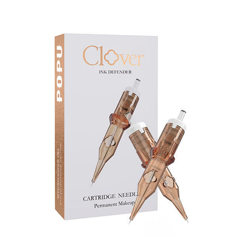
The two cartridges below let a studio test a small round liner for one-point work against a compact grouped round liner. In these specific ATTO listings, the opening digits correspond to the diameter family and the following digits identify point count. The RL identifies a round liner. These dimensions describe the cartridge. The line the viewer sees depends on the design, the arrangement of marks, and the working method. For comparisons across different catalogs, verify the individual diameter and stated taper independently of the suffix.
| Option | Diameter per point | Point count and grouping | Design job to assess | Size and stock decision |
|---|---|---|---|---|
| Pinky Pro 0601RL | 0.20 mm | One point, round liner family | Isolated fine accents and narrow junctions, within compatible equipment and the intended use | 20 cartridges, useful when that accent recurs across jobs |
| Thunder Pro 0803RL | 0.25 mm | Three points, grouped round liner | Main stem, small structural contour, or a lettering edge with stronger presence | 20 cartridges, useful when defined fine contours recur |
| Compact round shader | Check exact model | Multiple points in shader grouping | Small tonal island with room for a softer edge | Buy by the available area and tested footprint |
| Compact curved magnum | Check exact model | Curved multi-point row profile | Broader gradient in a miniature subject with room for its working edge | Consider when the brief regularly includes small value passages |
Put one point where its footprint matters
Consider a tiny moth design where the body and wing outline already establish the silhouette. A short isolated accent on the inside of one wing may be the best place for a single point. Evaluate that accent in the context of the whole drawing. If it only becomes visible when zoomed in, decide whether it belongs in the design at all. The Pinky Pro 0601RL, 20 cartridges is a narrow single-point option in a PMU-led series. For tattoo use, check the exact machine fit and the cartridge's intended application before stocking it for the workstation.
Give structural contours a separate choice
On a small fern, the stem often determines the main gesture. A three-point liner can make the stem visually distinct from the side branches without enlarging the whole piece. The Thunder Pro 0803RL, 20 cartridges is a compact grouped liner to consider for this job. Compare it with the single-point option using the exact curved section that matters. On a synthetic exercise, inspect the line at actual viewing distance before comparing the close-up. A better close-up matters when it also improves the full design.
Compare compatible cartridges under the same conditions
The cartridge must seat correctly in the exact handpiece and move smoothly when used according to its instructions. Groupings with different membranes or internal construction can feel different on the same pen. Hold the pen and exercise constant when comparing cartridges. For two lines of equal length, look at the continuity of the edges, the repeatability of the curve, and whether the outcome matches the drawn hierarchy. If choosing between two suppliers with similar grouping codes, confirm the stated taper and whether the cartridge fits the machine you already use. This isolates the actual reason to buy.
Short and middle machine strokes
Separate stroke, projection, and tissue depth
Mechanical stroke describes the travel produced by the drive during a cycle. Needle projection describes how far the working point extends relative to the tip in a specified position. Tissue penetration describes the interaction of the moving needle with skin. They use similar vocabulary and sometimes the same unit, yet answer three different questions. Skin position and movement add variability beyond the device geometry. A short-stroke selection can change the feel of the pen without establishing a penetration depth. A numerical stroke value belongs in an equipment comparison, while clinical observations about tissue belong in the appropriate training context.
Compare response on a specific line
A short or middle position can be useful when the design calls for repeated fine curves. The shorter setting gives the artist a different travel and response to evaluate. The middle setting gives a meaningful comparison when the same piece needs a more prominent grouped contour. Pick one curve from the actual design and assess continuity, ability to see the entry and exit of the mark, and whether the result fits its role. Changing both the machine and the grouping at once makes it harder to tell which purchase improves the work.
| Machine decision | Compare with | Useful observation | Common confusion | Buying implication |
|---|---|---|---|---|
| Short travel position | Middle travel with the same grouping | Whether the short line and curve feel more repeatable | Treating the machine's travel as tissue depth | Choose the range when the difference helps with a recurring mark |
| Middle travel position | The same outline at the shorter setting | Whether the structural edge matches the planned hierarchy | Equating a broader visible mark with more travel alone | Keep cartridge geometry in the comparison |
| Fixed response pen | Adjustable pen with a compatible grouping | How often the job needs a change of mechanical response | Replacing a useful machine before trying another grouping | Keep a familiar fixed setup if it solves the recurring jobs |
| Two-battery package | Same pen with one battery | Ease of handoff during consecutive bookings or demos | Confusing a spare with extra motor output | Favor the spare when uninterrupted station use matters |
| Different grip or balance | Same mark at same scale | Hand visibility and stability through a turn | Choosing on machine weight alone | Evaluate the complete setup with its intended power configuration |
Decide whether adjustable travel changes the day
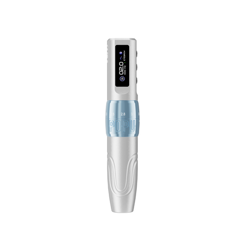
A fixed pen that already covers the studio's line and tone work remains useful. Choose an adjustable pen when you regularly need a different mechanical response between those jobs and can make a meaningful comparison on the same handpiece. The P3 Pro Pen + Extra Power offers six positions across 2.0–4.2 mm on the referenced configuration. For fine-line procurement, begin the comparison in its shorter and middle positions. The full range is most relevant when the same station also handles other tattoo work. The extra battery serves a different purpose by keeping a charged spare available for a handoff between bookings or demonstration blocks.
Evaluate power and handling as separate issues
A comfortable grip helps the artist see where a small line should end. A spare battery helps when the battery needs changing. A lower or higher power setting changes machine behavior in ways that depend on the model and load. For a mixed workstation, compare balance with the intended battery attached and with the specific cartridges you expect to use. Use the manufacturer's operating guidance as the starting point. An instructor can then assess how a change in machine response affects a particular exercise. Build purchasing decisions around the jobs repeated at the station, including who shares it and how often it switches tools.
Tissue depth and blowout
Distinguish the skin layers from the equipment settings
The epidermis forms the outer skin layer. The dermis beneath it is the intended anatomical region for durable tattoo pigment. Subcutaneous tissue lies deeper. These are anatomical terms. A moving cartridge, skin that is supported or shifted, and differences between body sites complicate the interaction in practice. A fixed projection or stroke number cannot represent the same tissue depth across people or placements. Learn placement, tissue response, and when to stop through direct observation with a qualified instructor. On a synthetic sheet, use the same setup to compare visible line consistency. The result belongs to that material and exercise.
Recognize why a small halo matters
Blowout is a form of pigment spread beyond the intended design. A published case report described pigment in the dermis and subcutaneous fat in a tattoo with a spreading blue halo. This provides direct evidence that excessively deep pigment placement can be involved. A remote photograph cannot establish where pigment sits or reliably distinguish pigment spread from other causes of discoloration. If a client describes an unexpected change, document the timeline and appearance in line with the studio's policy and direct concerning or persistent symptoms to qualified medical care. Published case report
Build checkpoints into live work
Before a booking, review the proposed placement, the required line hierarchy, and a design alternative that gives the small details more room. An artist working under supervision should know how the mentor wants to observe contact and tissue response and when to stop and review. During work, evaluate unexpected changes before adding more marks. Afterward, use healed photographs and a consistent review interval agreed with the studio to understand how the design reads. Take two separate questions to that review: how the line itself presents, and whether the spacing between adjacent lines supports the intended shape.
| Observation | Where it appears | Useful next check | Professional boundary | Design implication |
|---|---|---|---|---|
| Two lines read as one | Printed proof or healed photograph | Inspect actual-size spacing between the marks | Separate layout review from assessment of skin findings | Open the gap or simplify one mark in the next design |
| Unexpected diffuse halo | Outside an intended edge | Establish timing and document appearance | A qualified clinician can evaluate persistent or concerning changes | Review the placement and supervised workflow before another similar brief |
| Uneven test line on synthetic skin | One curve or several runs | Check stencil, cartridge seating, then the working setup | Limit the comparison to the material tested | Use the smoothest readable version as the design reference |
| Short interval looks unusually dense | Junction where lines meet | Compare the underlying sketch and overlap | Bring unexpected tissue responses to the supervising artist | Reduce duplicate contours where two elements intersect |
| Feature fades in a reduced proof | Close values or fine details | Isolate the main silhouette and value groups | Review artwork before attributing it to equipment | Enlarge or make the main edge more distinct |
Stencil preparation
Keep the identifying geometry
A stencil for a miniature subject is a set of landmarks. For a portrait, select the outline that establishes the head angle, the spacing of the features, and a few edges that locate the darkest shapes. Fine texture can stay in the separate reference. For a leaf cluster, retain the direction of the stem, the outside shape, and the points where leaves cross or attach. When an interior line serves only as decorative texture, put it on the separate sketch until you know that it fits at scale. This reduces visual competition while keeping important positions clear.
Diagnose the printed proof before moving to placement
Print a small section at actual size before committing a sheet to the entire design. If a line goes missing in the printed proof, compare it with the source at the same size. See whether a fine source mark is too light, whether the problem follows one part of the image, or whether it appears in multiple areas of a standard test. A line ladder and a pair of close curves provide a reference for separating file issues from printer or paper issues. Where the entire proof prints well but a tiny letter fills in, redesign that letter's opening and repeat the test at actual size.
Use placement to decide what to simplify
Show the client where the proof is meant to be read. Some designs are primarily seen from the front. Others wrap and need multiple stable views. A tiny script around a curve may need the initial and last letters to face a coherent viewing direction. A miniature bird can tolerate a tail that follows the body contour if the head and main wing remain visible. When a design loses its focal point around a turn, move it, rotate it, or reduce information near the bend. The ability to simplify one boundary can do more for the finished image than changing the equipment.
Three worked studio briefs
Case one: a botanical sprig with a delicate interior
A client brings an illustrated olive branch with fine veins throughout every leaf. Their priority is the recognizable branch, with an airy appearance from normal distance. Create a full-detail proof at a slightly larger scale and a shorter version with just the major veins. Compare both at the proposed placement. In the shorter proof, choose where an internal accent will be visible beside the main stem. Save a single-point footprint for that feature and test a compact three-point liner for the structural line. On the equipment bench, use the same stem curve with both choices. The result should show a visible difference between structure and accent while keeping both within the character of the illustration.
Case two: script with a letter counter that disappears
The client brings a name in an ornate typeface. In a full-size screen preview, the letters look open. In the proposed print size, the small loop of one letter closes and an adjoining flourish touches the next stroke. Show the client a proof with the loop redrawn and the flourish shortened. Compare it with a larger version that preserves the flourishes. If the revised smaller design reads well, examine the prominent baseline with a compact liner and reserve a fine point for selective terminals. Review the actual-size result as a word. The best close-up may matter less than whether the name remains easy to read.
Case three: a micro pet portrait that depends on one marking
The reference image shows a dark patch around one eye, a broad white muzzle, and a tilted ear. The original photo also contains dense fur detail. Make a three-value thumbnail first and compare it with the planned size in the placement proof. If the patch and ear already identify the pet, protect their outlines and leave the muzzle open. Use the drawing to plan one hard boundary and one softer transition. An artist comparing tools for this brief can test a compact liner at the hard edge and a shader footprint in the larger tonal island. If the shading grouping is wider than the available shape, change the tool or enlarge the design. Show the client the simplified proof beside the photo to agree which features carry the likeness.
Troubleshooting and healed review
Find the earliest point where the issue appears
Compare the source artwork, printed proof, synthetic test when available, and healed image where appropriate. If an interval is closed in the proof, the next step is to change the design or printing preparation. If the proof is clear but the test line wanders on every turn, look at the setup and how the curve is presented on the surface. If the result changes between flat and wrapped mock-ups, focus on orientation and spacing. The earliest place a symptom appears is often the most useful place to test an improvement.
Evaluate what changed between bookings
Review a comparable design where the studio liked the result. Look for changes in proposed scale, orientation, groupings, support, or the amount of detail assigned to the smallest marks. Keep the comparison tied to a visible feature. For example, compare the space between a script's strokes at one letter rather than labeling the entire design as too dense. Bring repeated issues to a mentor or experienced colleague with actual-size proofs and reference images. That gives the reviewer something specific to assess.
Compare healed work under consistent conditions
Use consistent angle, distance, and lighting when the studio's consent procedure allows documentation. Compare how the main shape reads in each photograph and then inspect the critical spaces. A close-up and a normal-distance view answer different questions. A portrait may need fewer fine details but stronger value separation. A script may need wider counters with the same line width. Keep the next change small enough that you can see its effect on the feature you identified.
| Symptom | Compare first | Useful next action | Equipment decision |
|---|---|---|---|
| Fine source line breaks in print | Actual-size image and print test | Simplify or increase contrast in the source | Compare printer and paper only after the source test |
| Counter closes in the stencil | Same word in two sizes | Redraw the tight loop or increase size | Keep the liner choice open until the design reads |
| Liner feels different after changing cartridge | Same pen and comparable compatible grouping | Review seating, membrane feel, and the manufacturer's instructions | Replace or change only the part linked to the repeatable difference |
| Main contour lacks presence in the synthetic test | Grouped liner vs single point on the same curve | Compare how the full drawing reads with both | Stock the grouped liner if it solves a recurring contour need |
| Tone and detail read as one dark patch | Three-value proof and final drawing | Simplify the interior texture, then recheck value separation | Choose a shader that fits the revised tonal shape |
| Workstation pauses between bookings | Battery handoff and charger access | Review when and where a spare can charge | Choose dual power when the handoff recurs |
Workstation buying plan
Assemble the linework station
Start with the pen you know and the compatible grouped liner that suits the most repeated contour. For a studio that also needs sparse detail marks, add the compatible single-point choice after reviewing its intended use. Select a blank 3 mm practice sheet if you need a bench surface for curves, joins, and actual-size lettering exercises. A single sheet can carry both a flat test and a portion you wrap over a clean practice form. Keep practice ink within that purpose. ATTO tattoo ink is for practice surfaces only.
Build a separate micro-realism extension
Add a tonal grouping when your common briefs contain shapes with enough room for it. Compare the working width with the actual shadow shape in a printed proof. A compact shader makes sense when the shape is confined. A curved magnum becomes a meaningful candidate when a recurring area has room for a gradual transition. Make the choice against one portrait value passage and one loose illustration passage to see whether it serves both. Start with the grouping that handles more of the work you expect to book. Expand only when the remaining marks need their own footprint.
Plan spare power and training capacity
A station used for consecutive appointments or demonstrations benefits from a charged spare that is ready at the point of handoff. If a single user has time to charge between sessions, a familiar power arrangement may already cover the workflow. For an academy, count how many stations are used at once, how long the demonstration runs, and whether every station has a compatible charging location. Choose a dual-battery kit when a spare simplifies those transitions. Standardize the course grouping list separately so the instructor can demonstrate the same main contour and small accent at each bench.
Continue to the focused companion topics
Use the cartridge comparison to revisit single point and grouped liners, and the machine comparison when deciding whether another pen or battery configuration fits the workstation. Return to the stencil preparation for small lettering and portrait landmarks. The specific decision in each section can stand on its own when a reader arrives from a focused article.
Frequently asked questions
Is fine line always a single-needle tattoo?
Fine line describes how the design reads. A single point is one tool for making selected marks. A fine-line sprig may benefit from a compact grouped liner at the stem and a single point for an isolated accent. Compare both with an actual-size proof. The contour that carries the design can have more weight while the overall piece retains a delicate appearance.
Should I start with 0601RL or 0803RL?
Start with the task you repeat most often. The 0601RL offers a 0.20 mm single-point footprint for restrained accents in compatible equipment and within its intended use. The 0803RL uses three 0.25 mm points in a grouped liner and is a useful choice when the job is a small structural contour. If you regularly work on both marks, compare the two on the same design and keep each for its distinct role.
Does a shorter stroke prevent blowout?
A shorter setting changes mechanical travel. Tissue contact also involves the artist's handling, the body site, and skin behavior. Blowout describes pigment spreading beyond the intended boundary, and clinical assessment is appropriate for persistent or concerning changes. Use shorter and middle stroke comparisons to select a mechanical response on bench material, and use supervised professional training to evaluate live work.
How deep should a fine line be?
The dermis is the anatomical target region for durable tattoo pigment. An appropriate technique depends on the site and its tissue response, and depth cannot be read off a stroke or projection specification. Learn to recognize appropriate working conditions and when to pause through direct supervision. A synthetic sheet is useful for comparing marks on that sheet and for discussing tool control with a mentor.
Can I preserve the same detail by choosing a thinner cartridge?
A smaller footprint can fit a particular accent, but the entire design still needs space for features to read separately. Print it at the proposed size and identify the exact gap that closes. Redraw that area, enlarge the design, or remove the lower-priority mark. Use the cartridge comparison after you have a readable proof.
What matters most in a micro portrait stencil?
Keep the geometry that identifies the subject: the head angle, feature positions, main silhouette, and the large shadow boundary. Carry secondary texture on the visual reference. If a reduced three-value proof has lost the likeness, correct the underlying shapes before adding more stencil lines or buying a smaller grouping.
Is a two-battery adjustable pen useful for every fine-line workstation?
It is a strong fit when the same pen moves between line and tonal jobs and the station needs a charged spare through consecutive bookings. If a fixed pen already gives the needed response and the charging rhythm suits the schedule, compare new cartridge footprints first. Separate the need for adjustable travel from the need for another battery.
Why does a script look readable on screen but crowded in the stencil?
The screen may show it larger than the working size. Printing can also expose tight counters or adjacent strokes that touch at final scale. Print two versions at actual size and review them from the expected distance. Try opening the interior of the tightest letter or removing a redundant flourish before changing the grouping.
How should a studio evaluate a fine-line result after healing?
Photograph with consistent lighting, angle, and distance when the client's consent allows. Review the whole image and then inspect the specific edges and gaps identified in the consultation. Compare with a similar design to see whether scale, line hierarchy, placement, or value structure needs attention. For unexpected changes in the skin or persistent symptoms, refer the client to a qualified clinician.