

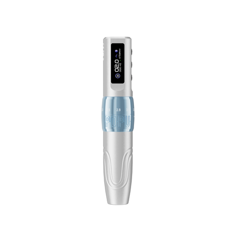
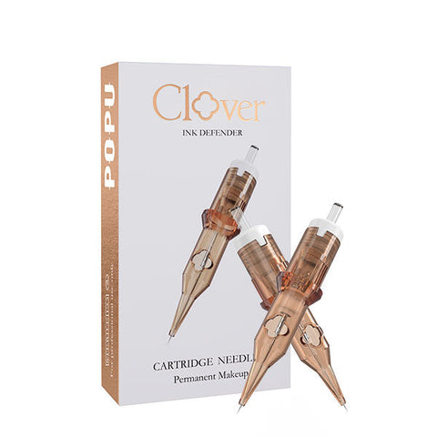

A black-and-grey portrait succeeds when the likeness reads before the texture does. Build a clear light side and shadow side, reserve the brightest passages, and use your darkest marks to reinforce the features that carry the expression. Then choose the cartridge and machine response that can place each value at the required scale. For most artists buying one pen for portraits, the EZ P3 Pro Black Matte with Extra Power is the starting choice. Its adjustable travel gives you a mechanical option for both wider shading and tighter feature work, and the matching spare module supports longer bookings. Pair it with a curved magnum sized to your main shadow plane and a compact grouping for the features.
Whip shading gives a directional fade. It can connect a cheek shadow to a lit plane, soften the outer silhouette of hair, or turn an even background into a graduated field. It works best when the reference already tells you where the darker end starts, where the value should break, and where bare skin should remain. This guide follows that sequence from the reference to the final bench order.
Contents
- Build the value structure
- Translate the portrait to its placement
- Build a useful graywash ladder
- Choose the cartridge footprint
- Use whip shading to turn form
- Choose machine travel and power
- Plan the appointment and review the result
- Troubleshoot common portrait failures
- Frequently asked questions
Build the value structure
Identify the two main light families
Look at the reference small enough that eyelashes and hair strands disappear. Can you tell which side faces the light? Choose one coherent light family and one shadow family before deciding how many intermediate washes the piece needs. On a three-quarter face, the cheek toward the source can stay largely light even when a highlight is interrupted by freckles or a crease. The farther cheek belongs with the shadow mass even when a reflected light lifts its outer edge. If those two groups trade places, the portrait starts to look flat even though each feature contains plenty of detail.
A useful preparation exercise is to draw each family as one shape. Follow how the brow casts shade toward the eye socket and how the nose casts a separate shadow on the cheek. Identify the strip of reflected light that belongs inside the shadow family. This gives the working session a map of which areas must remain connected as lighter transitions are added.
Getty's study of value and form uses changes in lightness and darkness to describe three-dimensional form. The same visual idea helps when preparing a tattoo reference, even though the materials and working surfaces differ. Compare an image with five narrow steps of gray to one with a clearly separated light and shadow. The latter may read more immediately despite carrying less detail. The artist can then bring back individual steps where they explain the roundness of a cheek or the changing edge of a shadow. Getty, Exploring Value to Create Form
Separate form shadows from cast shadows
A form shadow describes a surface turning away from light. A cast shadow describes one surface blocking light from another. The edge under a nose can be fairly distinct near the point where the shadow starts, then soften farther across the cheek. The turn of a rounded cheek or forehead usually needs a longer transition. If each boundary receives the same feathered edge, the face loses cues about which shapes overlap. If each boundary is sharp, the portrait starts to resemble cut paper. Plan the edge along with the value so your tool choice supports the shape you see.
Decide which darks carry the likeness
Put the deepest planned darks near the features that define the expression. In one portrait that might mean a pupil, the near nostril, and the short line where the lips meet. In another, it could be the shadow from the eyelid and a narrow join between the jaw and collar. Compare the lengths and widths of those accents against the source. A large dark mark immediately pulls the eye. A shadow placed in the wrong part of a mouth can change the apparent smile even if its value is plausible.
Reserve the lights while the drawing is simple
Mark the light areas you intend to leave open before filling the adjacent shadow. A nose bridge, a narrow reflection at the lip, and a patch of forehead can work together as a group. Preserve enough width for those shapes to read at the intended viewing distance. Inside that group, select the smallest accents to keep bright. Let the neighboring half-tones supply the turning form. This is the point to simplify reflective highlights that would compete with the eyes or pull attention to the edge of the composition.
| Value function | Portrait example | Edge decision | Main working question |
|---|---|---|---|
| Reserved light | Nose bridge or forehead reflection | Clear opening into the surrounding value | Does it still read at tattoo size? |
| Light half-tone | Near cheek rolling away from the source | Broad transition | Where should the fade begin? |
| Main shadow | Far cheek or eye socket | Soft turn with selected firm edges | Is the shadow still one connected shape? |
| Deep accent | Pupil, nostril, or mouth junction | Short and deliberate | Does the accent support likeness? |
| Reflected shadow light | Jaw edge facing a pale collar | Soft within the shadow family | Does it remain subordinate to the main light? |
Translate the portrait to its placement
Crop for expression and readable scale
A tight crop around the face puts more of the available space into the eye, mouth, and jaw proportions. A portrait with a full figure or substantial background gives each feature less room. Ask the client which elements matter most before sizing the artwork. If the likeness carries the story, simplify secondary clothing or background texture before sacrificing feature space. If a hat, glasses, or hairstyle defines the subject, keep its silhouette and reduce texture inside it. Compare the two crops at their proposed size so the customer can see what each option gives the portrait.
Check the face at the actual size
A feature that looks comfortably separated on a monitor may merge when the artwork is reduced. Check the gap between the iris and the upper lid, the nostril opening, and the bright edge above the lower lip. Give each important shape enough physical room for the planned cartridge and motion. If two dark accents occupy a narrow space, combine them only when the original expression survives the merge. Enlargement is often the direct solution when the reference depends on several distinct edges in a small area.
Read the artwork on the body in a natural position
Check the portrait when the client holds the limb in a natural resting position and again through ordinary movement. A design that looks balanced on a flat image can shift as it crosses a curve. Place the eyes and mouth where the important relationships remain easy to see. Let the less critical background or softer side of the silhouette take the more pronounced wrap. A photograph of the planned placement at a natural viewing angle can reveal an unwanted curve through the eyes before the working session starts.
Keep the stencil readable through the first passes
A portrait stencil needs the landmarks that hold the proportions together. Use enough information to locate the eyes, nose, mouth, and major light breaks. Keep delicate texture subordinate to those landmarks. If the transfer reproduces every small detail, the artist can lose the larger turn of form when looking through the accumulated lines. Make a separate reference for the full range of values and use the stencil for placement. Before starting, compare both with the actual client placement so the direction of the face and the key gaps still agree.
Adapt a low-contrast family photograph
Family photographs often arrive with their brightest and darkest areas close together. Ask what the client remembers about the expression and which features must survive. Then compare a simple shadow study with the untouched source. A darker eye socket in the study may clarify the face, while an exaggerated shadow at the mouth may change the expression. Keep the structure of the original and strengthen selected distinctions that are already visible. When the photograph lacks the information needed to separate the pupils, eyelids, or expression, ask for another reference of the same subject before building the stencil.
If a secondary photograph shows a detail more clearly, use it to understand the feature and then check it against the angle of the main reference. An eye seen from the front has a different apparent width from the same eye seen in three-quarter view. Cross-check the landmarks before transferring details. For a small keepsake piece, reduce background and texture first. Give the important edges enough room to keep their original relationships.
Build a useful graywash ladder
Assign each wash a job
Start with the shadows the portrait needs and choose a manageable series of values. A broad mid-value can connect the cheek and temple, while a lighter value can help turn the edge into open skin. An intermediate wash earns its place when it fills a visible gap between two adjacent areas. On a small portrait, a simpler ladder can make the distinction between the light and shadow families more obvious. On a larger portrait with a broad, slow turn, another intermediate value may help extend the transition without placing all the burden on repeated passes.
Compare premixed and artist-prepared workflows
A premixed set gives the studio named steps within a product family and makes replenishment easier when more than one artist uses the same system. An artist-prepared workflow gives an experienced operator more control over the steps the image needs. Follow the relevant product instructions, local requirements, and studio procedures for any preparation or handling. The useful comparison is how clearly the set separates adjacent values and how reliably the studio can maintain it across appointments. A ratio passed along by another artist cannot account for your products, grouping, reference, or handling conditions.
Judge a value in context
A wash that looks light in a cup can read darker beside open skin, and a middle value can look lighter next to a deep anchor. Compare it against its two intended neighbors. If the target is a soft roll across a cheek, look at the full distance from its light side to its shadow rather than focusing on a single strip. A stepped transition might come from the value choices, the overlap of marks, or both. Work with that distinction. Selecting a lighter step can help a genuinely abrupt value change, while a gap caused by inconsistent overlap calls for a different pass pattern.
Allocate an intermediate value to a particular plane
Consider a portrait with a side-lit forehead and a near cheek mostly in light. A broad forehead turn may justify an intermediate value between the principal shadow and the light half-tone. The narrow shadow under the nose may read better with a quicker change because the reference shows a clearer cast edge. Use the extra step on the forehead where there is room to see it. Repeating it automatically at the nose can blur a cue that helps the subject look familiar.
Review the reference as a set of neighboring shapes. A reflected light from a collar can interrupt the edge of the neck shadow without reaching the brightness of the open cheek. Give that reflection enough separation to read as a turn inside the shadow, then compare both shapes together. If the reflection attracts attention first, reconsider its width or the value next to it. The aim is for the viewer to see a connected head and neck before noticing the particular wash used there.
Separate practice ink from live-service stock
Use practice materials for synthetic exercises and keep their purpose clear at the bench. The U9 Tattoo Practice Kit contains True Black practice ink for the supplied practice skins. For client work, evaluate the product's stated use, supplier documentation, packaging and lot, and the applicable rules for your location. FDA's tattoo safety materials describe contamination concerns, including ink in sealed bottles. Keep stock identifiable so a particular shade or lot can be isolated if a supplier alert applies. FDA tattoo safety · FDA final tattoo ink guidance
| Working value | Example assignment | Useful check before committing |
|---|---|---|
| Dark anchor | Deepest part of eye or nostril | Confirm placement and width against the reference |
| Deep shadow | Eye socket or far cheek | Check that the whole shadow stays connected |
| Mid-value | Broad turning plane | Compare both neighbors at intended viewing distance |
| Light transition | Edge of temple, nose, or cheek | Preserve enough room for the light to open |
| Unworked light | Deliberate bright shape | Check continuity and spacing in the actual placement |
Choose the cartridge footprint
Use curved magnums where the curve has room
A curved magnum puts a broad footprint across the working area with outer pins set back relative to the center. That shape gives the artist a way to feather a broad pass at the sides. It is useful across a cheek, forehead, neck shadow, or simple background. Choose the width based on the broadest continuous zone you can work without crowding the surrounding features. The Thunder Pro curved magnum range is the first basket line for these areas. Select a group that can turn the plane while leaving the adjacent highlight space clear.
Match small planes with a compact shader
The lower lid, nose wing, and corners of a mouth often have enough area for a shaded patch but little room for a broad group. Use a compact shader where you need to place a small value without expanding the boundary of the feature. In a portrait, a small shadow can anchor a larger transition, so a consistent footprint matters. Decide whether the local shape is a patch, a short line, or an edge connecting two planes. A small grouping can do useful work when the artist knows which of those jobs it has.
Reserve liners for decisive marks
A liner can sharpen a short accent at the iris, a crease, or a texture break. Give those marks a reason to be sharp. A portrait composed of outlined features starts to read as a drawing of separate parts. A selective line at the lip junction can describe the mouth while a graduated edge describes the lower lip's volume. The Thunder Pro round liner range gives a compatible option for concentrated marks. Choose the size based on the accent's width and placement.
Compare width before chasing smaller diameters
Pin count and individual diameter are separate decisions. A grouping's overall footprint depends on arrangement and size, while the pin diameter contributes to the size and distribution of individual marks. Comparing two needles by count alone can hide a meaningful difference. Read the actual configuration and consider the job in the portrait. Start with the width the plane can accommodate, then choose the character of mark that gives you the transition you want. Buy the widths that serve repeated portrait jobs before adding a specialty group for a rare texture.
| Work zone | First grouping to assess | What the choice buys | Change the choice when |
|---|---|---|---|
| Broad cheek or forehead | Curved magnum | Wider field with a featherable edge | Nearby light shapes become crowded |
| Tight eyelid or nose plane | Compact round shader | Defined small patch of value | The intended mark is a narrow accent |
| Nostril or mouth junction | Round liner | Focused dark accent | The feature turns gradually into a larger shadow |
| Background fade | Curved magnum suited to the open field | Fewer narrow tracks across the gradient | Body contour or a nearby silhouette restricts the pass |
| Selected texture | Grouping matched to the smallest useful mark | Deliberate detail at readable scale | The texture starts competing with the likeness |
Use whip shading to turn form
Choose a starting edge and a fade direction
A whip is a directional mark. Plan where the darker portion belongs and where the mark opens into the lighter area. Across a cheek, point the fade along the surface turn rather than sending a row of identical marks across every part of the face. For a background, shape the fade so it supports the silhouette. A directional fade can help the eye follow the curve from a darker temple toward the cheek, while a series of parallel marks aimed the same way everywhere can make the skin read like a flat field.
Overlap marks where the plane needs continuity
The spacing between adjacent sweeps affects how easily a field reads as one value. On a broad plane, consistent overlap in the darker section and more openness toward the light can connect the passage without drawing attention to the individual tracks. At a small feature, shorten or reorient the working motion to suit the shape. When practice marks form bands, compare the spacing at the beginning, middle, and end of the movement. A repeated transition near the same point in each stroke can create a visible line across the field.
Change direction around a shoulder or neck curve
On a portrait that wraps toward the back of the arm, the background can turn faster than the face. Plan the fade in sections that can be viewed from the intended angle. One section can follow the outside contour of the head while another opens along the shoulder. The transition between sections deserves attention because their marks approach from different directions. Review the point where they meet from the natural resting pose and place the least visible seam in a part of the background that has room for a gradual value change.
Within the face, a shadow below the jaw can lead into the neck with a shorter fade than the background. Keep the neck tone connected where it helps the silhouette and use a tighter footprint if the collar or another edge narrows the working area. This gives two distinct jobs to the shading setup. The broad field puts the head in space, while the local neck shadow describes the turn of form.
Know where a hard edge belongs
A firm edge can describe the top of a nostril or the place where an eyelid overlaps the eye. Keep that edge where it explains the form. Use a softer adjacent passage to show the surface rolling away. If you feather every cast edge, the overlapping shapes can lose their separation. If you hold every edge firm, the scene loses depth. Choose one hard edge to anchor a feature and let another edge disappear into a connected tone where the reference supports it.
Compare motion in a controlled practice exercise
Prepare an exercise with one wide curved plane, one narrower edge, and one light opening. Keep the reference and practice surface the same while you change the grouping or the machine response. Look for a repeatable dark start, a readable transition, and a clean light opening. This comparison helps the artist understand which change belongs in the handpiece or grouping and which belongs in the motion. A synthetic exercise offers feedback on consistency and handling. Evaluate client work through professional training, the actual tissue response, and the healed result.
Choose machine travel and power
Define what stroke length changes
Stroke length is mechanical travel in the drive. It describes how far the mechanism moves through its cycle. The artist separately controls the working setup and movement. A change in travel can change the response you feel when pairing the machine with a grouping. It does not establish how far the needle will enter tissue. Compare what the change does to the actual mark and the control of the edge. A shop can teach what each setting contributes without prescribing the same stroke setting, voltage, or depth to every artist and placement.
Choose adjustable travel when the portrait changes jobs
The P3 Pro with Extra Power provides six stroke settings from 2.0 to 4.2 mm and a standard universal cartridge connection. Consider its adjustment when the session changes from a large shading field to a small feature where you want a different working response. Start with the grouping that fits the plane, then assess whether changing the travel improves your control of that mark. A matching spare power module gives the artist a ready change without moving the portrait to another handpiece.
Keep fixed travel when the studio already works around it
The Thunderlord Power Pulse Gold with two batteries uses fixed 4.0 mm travel and standard universal cartridges. Choose it when the artist prefers that response across broad shading and detail and expects to adjust grouping and operating frequency to change the mark. Keeping one travel can be especially useful when staff share a setup and understand how it feels with the selected cartridge families. The decision is whether fixed mechanical travel supports the style of portrait your shop does most often.
Separate motor load, drive response, and speed
A broader grouping can change the demand the artist feels at the handpiece. The drive, cartridge, and chosen working response all contribute to that feeling. Treat a claim about motor torque as a claim about the specific machine. The stroke number alone does not tell you how a pen will carry every cartridge under load. Use the cartridge that fits the planned mark, then evaluate consistent movement with that tool. If a larger grouping feels unmanageable or the silhouette gets crowded, the better answer may be a smaller footprint and a different sequence across the plane.
| Equipment choice | Mechanical travel | Where it helps | What to pair with it |
|---|---|---|---|
| P3 Pro with Extra Power | Six settings, 2.0–4.2 mm | Moving between broad planes and compact features with optional stroke changes | Compatible curved magnum, compact grouping, matching spare module |
| Pulse Gold with two batteries | Fixed 4.0 mm | Familiar travel across a varied portrait with grouping and frequency changes | Compatible shading and detail groups, matching spare battery |
| Dedicated spare handpiece | Depends on the model selected | Continuity if a handpiece needs replacement during a booking | Its own compatible power, with known cartridge fit |
| Grouping change within one pen | Same or adjusted depending on the pen | Matching a new plane width without rebuilding the bench | Fresh cartridge of the correct footprint |
Plan the appointment and review the result
Establish a work order around the landmarks
Start with the shapes that orient the portrait. Protect the landmarks needed to place the eyes, nose, and mouth as you work through the value families. Work in an order that leaves the next important edge readable. A dark area can guide the nearby half-tones after it is established, while an area of reserved light needs a clear boundary so it survives the surrounding passes. Decide which landmark you need next each time you move to another zone.
Stage the equipment around changes of role
Lay out the compatible broad and compact cartridge roles separately and put the matching charged spare in the clean supply area. For a larger portrait, think through the sequence of work as part of the purchasing decision. A wider grouping may make sense for the background while the same machine moves to a smaller group for the face. If a second artist is working simultaneously, that position needs its own working handpiece and power. A spare module supports the first pen during a change.
Prioritize the next purchase from your booking mix
Look at the next group of booked portraits and identify the tool each one asks for. A studio doing large memorial pieces will use broad shading stock differently from an artist doing tightly cropped portraits on narrow placements. Buy enough of the grouping that recurs, then add the feature grouping that complements it. If the pen response already serves both jobs, an additional compatible cartridge footprint may have more immediate value. If the booking repeatedly calls for two working responses within one portrait, the adjustable pen gives the artist a practical way to keep the same handpiece through the transition.
Compare healed outcomes under consistent viewing
Use comparable lighting and viewing distance when reviewing finished work over time. A close fresh photograph can make the darkest points and most visible texture dominate your judgment. A healed image viewed at a similar scale shows whether the light and shadow structure still reads across the whole placement. Compare major shapes first, then the features, and finally the smallest texture. Use what you see to decide which future design needs more separation, which transitions hold their shape, and which details can be simplified.
Troubleshoot common portrait failures
Muddy values through the face
Revisit the light and shadow map. Check whether the light half-tones became too close to the shadow family or whether the eye socket, cheek, and jaw were broken into unrelated small patches. A portrait can have several gray values and still read as one indistinct middle. On the next layout, reserve the brightest group early and choose a clear boundary for each main shadow. Use smaller changes within each family while keeping the difference between the families visible.
Visible bands in a broad fade
Look for consistent lines where adjacent passes start or end. Then compare the wash steps and the overlap of the movements. A steep jump between adjacent areas may need an intermediate value. A series of regular tracks may need a changed spacing pattern or a footprint better matched to the width. Use a controlled practice comparison so you can see which variable changes the pattern before bringing the adjustment into a professional appointment.
Features that read too hard
Compare the full face before adding more dark accents. Check whether every eyelid, lip edge, and nose contour was outlined with the same weight. Look at the reference for a place where one of those edges naturally disappears into a shadow or turns gently into light. A tighter grouping can help localize a decisive mark, while a shaded transition gives the surrounding feature room to turn. Preserve the contrast where it helps recognition.
| Symptom | Likely place to investigate | Next decision |
|---|---|---|
| Flat cheek | Main light and shadow families | Recheck the turning plane and preserve a brighter group |
| Stripe through the gradient | Repeated start or stop line, value jump | Test changed overlap or an intermediate value |
| Wide dark near a feature | Grouping footprint or placement of the accent | Compare a smaller footprint against the source |
| Busy background | Value or edge competing with the face | Simplify the background and leave a cleaner silhouette |
| Poor read at normal distance | Crop, scale, or lost negative space | Increase feature separation at layout stage |
Frequently asked questions
Should I buy a curved magnum before a compact shader?
For a portrait with a broad cheek or background fade, start with the curved magnum and add a compact group for the smaller features. For a small portrait with tightly grouped eyes, mouth, and nose, start with the footprint that fits those features and add a wider option when the booked design has space for it.
What stroke setting should I use for a black-and-grey portrait?
Select the working response by grouping, the mark required, the machine, and your professional training. An adjustable pen gives you more mechanical choices when moving from a broad shade to a small accent. A fixed-travel pen gives you one familiar response while grouping and operating frequency change the mark.
Can a single wash produce an entire portrait?
It can serve a deliberately limited design when the artist can create enough separation through the way marks are placed and the amount of open space left. A wider value ladder helps when a portrait needs a broad turning plane, a deep anchor, and a visibly lighter transition in different areas.
How many shades should I put on the bench?
Start with the number of distinct value jobs the drawing calls for. Use the darks that establish recognition, a shadow field, the half-tones that turn the form, and the unworked light. Add an intermediate wash when a specific transition needs another step you can see.
Is whip shading the right technique for every soft edge?
Use it for a directional fade that helps describe the surface or the background. Keep a more definite edge where the reference shows an overlap or a clear cast shadow. A portrait benefits from edges with different degrees of definition, arranged around the features that matter.
Does adjustable stroke replace changing needle groups?
Stroke changes mechanical travel. Changing the grouping changes the footprint on the surface. Switch groups when the width or shape of the mark changes. Adjust travel when the new job also benefits from a different response.
Which setup should I buy if I can only take one pen to the appointment?
Choose the P3 Pro with Extra Power for a portrait with distinct shading and feature work and a clear reason to vary travel. Add the broad and compact cartridges the drawing actually needs. Choose the dual-battery Pulse when 4.0 mm fixed travel is the response you already prefer for those jobs.
Can I use the practice kit ink for a client?
Use the practice kit's ink for the synthetic exercise it is supplied for. For a client appointment, source products identified for the intended professional service, check the package and lot, and follow applicable handling and regulatory requirements. Keep practice supplies separately identified so the wrong stock does not reach the client bench.
What should I assess before deciding to buy another pen?
Check whether the limitation is response, cartridge footprint, battery coverage, or the number of people working at once. Solve the first with a machine suited to the response you want, the second with a grouping, and the third with matching spare power. Buy a second handpiece when you need a true equipment reserve or an independent position.