

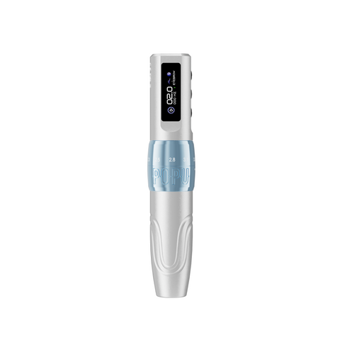
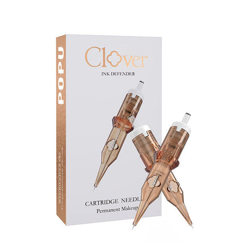

Choose the machine and cartridge for the marks in the drawing. A traditional flash piece asks for a clear outer line and deliberate fills. Neo-traditional often adds layered values and narrower shape transitions. Blackwork depends on the relationship between solid dark and open skin. Dotwork turns the spacing of individual points into value. An artist working across all four will get the most range from the Black Matte EZ P3 Pro with Extra Power, paired with separate liner and coverage groupings. Choose the Pulse Gold with two batteries when you prefer a consistent 4.0 mm travel and want to change the mark through the cartridge, movement, and operating frequency. Start by deciding which edges must remain clear at the actual tattoo size.
Contents
- Read the four styles through their marks
- Build an American traditional piece
- Build a neo-traditional piece
- Plan blackwork around open skin
- Build dotwork through spacing
- Match the cartridge and machine to the job
- Plan the session and diagnose the result
- Frequently asked questions
Read the four styles through their marks
Start with the silhouette
Shrink the artwork to the proposed tattoo size and look away for a moment before you inspect it. Which shape do you recognize first? The test works for a traditional swallow, a neo-traditional animal, a blackwork panel, or a dotted ornament. It exposes areas where the outline depends on tiny details to read and shows whether the shape survives the body's curve. Pick the silhouette before selecting a pen or needle. The decision sets the width of the contour, the room available to cover an interior, and the value relationships the rest of the piece has to maintain.
Distinguish a style from its historical examples
The National Museum of the U.S. Navy documents tattooing in naval culture, including meanings attached to recurring motifs. The Smithsonian's collections describe how electric equipment helped change the trade. These sources give traditional flash historical context. A contemporary artist can use that visual vocabulary while making a distinct design for the customer. Blackwork and dotwork can also appear in different cultural and contemporary contexts. Study the origin of an individual symbol and discuss its meaning with the client before treating it as interchangeable decoration. National Museum of the U.S. Navy, Marked by the Sea · Smithsonian, A Revolution in Tattooing
Classify marks within a mixed piece
A single design can use a dark blackwork field, dotted fades, and the confident silhouette associated with traditional flash. Build the plan around what each element does. A dark block frames the subject, a dotted edge turns the value, and a short liner mark establishes a feature. Identify the pieces with different jobs before buying several similar-looking cartridges. This also helps when explaining a revision to a customer. You can show which gap would disappear when the piece gets smaller and offer a crop or size that preserves the original idea.
| Style or approach | Main visual job | Edge priority | Typical second cartridge role |
|---|---|---|---|
| American traditional | Readable motif and decisive separation | Strong silhouette and clear internal junctions | Broader coverage where a bounded shape allows it |
| Neo-traditional | Silhouette plus layered planes | Hierarchy between contour, texture, and transitions | Curved magnum or compact shader by plane width |
| Blackwork | Balance a dark mass against open space | Clean negative channels and boundaries | Grouping sized to the interior of the field |
| Dotwork | Make density read as value | Control point spacing near light gaps | Compact point grouping or separate field tool |
| Mixed composition | Keep each mark in its own role | Reserve the clearest edge for the focal shape | Add a tool only when it solves a distinct job |
Build an American traditional piece
Work through a two-color dagger and flower
Start with the blade, guard, and flower as three shapes. At the client’s proposed size, the blade and the flower may overlap in only a short section. Give that overlap the strongest internal edge. Put the colors into separate shapes on the drawing and see whether the flower still reads if you view the artwork from a few steps back. If the two colors sit at a similar value, a reserved opening at the junction can do more for separation than adding another line. Make the flower’s outer silhouette complete enough to hold its place against the blade without adding detail to every petal.
The tool order follows the drawing. A liner carries the long blade edge and the flower silhouette. A coverage group can fill the main petals. The narrow junction at the guard may need a smaller footprint or an open gap. Choose that before you order cartridges. If the studio offers the same design at two sizes, place both transfers next to the chosen tools and check which interiors really accommodate the wider group. The smaller version may work well with the same handpiece and a different cartridge basket. Price the flash around the time and materials each version actually takes.
Design the line around what the eye sees first
In a bold flash drawing, the outer contour often carries the motif. A swallow reads first by wing and tail shape, then by the marks inside it. Give the silhouette enough weight to remain visible alongside the darks. Keep the internal lines distinct where they separate forms, such as the junction between wing and breast. Watch for a place where three lines meet in a small patch. A slight change in the drawing can give the artist a more readable join than a smaller cartridge can provide at the same size.
Use fewer color shapes with clearer boundaries
Define which area gets a solid fill, where a transition belongs, and which opening should remain. A flower can have a dark base, colored petals, and open tips. The light areas give the filled shapes room to stand out. Check the relationship of the values even when the design uses color. A heavily filled petal and a heavily filled leaf can merge at a small scale when the inner line is narrow or their values are close. Make that separation part of the artwork before treating it as an execution problem.
Match the grouping to the narrowest repeatable segment
A Thunder Pro round liner is a starting family for focused contours. Choose a specific grouping by the width of the planned line and the space at the tightest corner. A tool that feels ideal on the long outer curve may crowd a small junction. Give that junction a smaller grouping or simplify its shape. For the broad fill, pick a compatible coverage group that fits the interior while leaving you room to approach the edges. A round shader can be useful when the area is narrow and the wider pass has nowhere to turn.
Keep the flash readable when the client asks for a smaller size
Put the small version beside the original and look at the distance between adjacent outlines and filled areas. A customer may prefer a smaller piece while still expecting the same expression or movement. Remove a secondary mark, open a gap, or simplify a small fill to protect the main motif. Explain the revision with the print at the intended size. It is easier to discuss the value of a cleaner wing shape or a clear break between petals when both drawings are visible. Size and drawing decisions often preserve more than a change of equipment can.
| Flash region | Plan it as | Tool decision | Check before committing |
|---|---|---|---|
| Long outer contour | Primary silhouette | Round liner matched to line width | Weight through the bend and closure |
| Small junction | Separation between overlapping parts | Compact liner footprint | Room for each adjacent shape |
| Broad petal or wing interior | Bounded field | Coverage group sized to the opening | Distance from border and reserved light |
| Narrow leaf tip | Small fill or intentional gap | Compact grouping if filled | Point still readable after adjacent fill |
| Repeated dots or short accents | Secondary detail | Focused grouping | Accents support the motif at full size |
Build a neo-traditional piece
Let the focal shape lead a framed animal design
Consider a fox head inside an ornamental frame. The eye and muzzle carry the expression. Give them the clearest contrast. The frame can read through a simpler arrangement of dark and light, even if it occupies a large part of the placement. Make the boundary between the head and frame easy to see, then look at each side of the artwork independently. If both contain equally heavy detailing, remove a repeated edge from the frame or leave a longer area of quiet tone. This lets the viewer see the subject first and discover the decorative marks after that.
The coverage grouping has two jobs here. The open portion of the frame can use a broader pass. The face needs a smaller group where values change beside the eye or where the fur turns into a narrow point. Reserve the liner for the short boundaries that explain the overlap. This gives the artist a reason to own more than one footprint and a place to use each one. Use the adjustable pen if the move between those tasks also benefits from a different mechanical response. The marks themselves provide the basis for choosing between the setups.
Give the contours a hierarchy
A neo-traditional piece may combine a strong outer line with smaller interior edges and several values inside the subject. Decide which contour must carry the whole design, which inner line marks an overlap, and where shading alone can separate two planes. An animal portrait may need a clear outer silhouette and a decisive edge at the eye, while fur on the cheek can turn through tone. If every small tuft has the same line weight as the outline, the subject can look more fragmented. Use fewer strong edges so those edges keep their influence.
Plan layered values with a dominant subject
A large illustrative flower or animal can carry many details. Choose which value family belongs to the subject, which supports the background, and which appears as a small accent. A framing element can still show depth without competing with the head or main flower. Use the reference to identify the shapes that must stay connected. Lay out the largest values first on paper. Then see where a gradient genuinely turns a form and where a more decisive division would preserve the drawing.
Select the width for the actual plane
A Thunder Pro curved magnum gives a wider footprint with a featherable edge for an open plane or fade. A compact group suits a narrow fold or small shape near a contour. On a large head and shoulder composition, the cheek might support a broad pass while the corner of the eye needs a localized mark. Choose around the narrower of the useful widths before ordering large quantities of one configuration. That prevents a bench that is strong at backgrounds and short on the tool that places the expression.
Use the color plan to decide which edges receive a transition
When two adjacent colors are close in value, a clear edge can preserve the distinction. When the design depends on a slow turn, give the gradient enough width to show it. A layered petal and a band of decorative color can be approached differently even when both are curved. The transition should reveal the shape from the main viewing angle. Work from professional products identified for the intended use and follow applicable handling requirements. Keep synthetic training supplies identified separately. FDA tattoo safety
Plan blackwork around open skin
Use a wrap to test the intended direction
For a wraparound blackwork panel, choose the angle from which the main shape should be seen. Mark which channels need to be visible together at that angle. An opening that feels generous on the inside arm may become visually narrow near the side, even when its measured width stays constant. Widen a critical channel where the body curve reduces its apparent size, or reposition the edge to preserve the intended movement. Recheck the layout when the client relaxes the limb and when they turn it naturally. The view they see every day is part of the design.
Plan how the broad dark passage reaches the narrower parts of the wrap. Leave enough room for the edge tool to approach each turning corner. If the largest coverage group can work the center but gets crowded near an opening, give the opening its own smaller tool and plan the transition between the two regions. Rehearse the junction on an appropriate synthetic exercise if the combination is new to the artist. Compare how the two marks meet under consistent viewing. The point of the exercise is to anticipate a visible seam and choose an approach that preserves the shape.
Make the dark shape intelligible by itself
On the preparatory image, look at the black mass on its own. Read the direction of the shape and check where it wraps. A dark area can connect two parts of an ornament or frame a figure. If it expands into every available corner, the silhouette may read as a single block with little structure. Cut deliberate open areas into the drawing where they reveal the form. Those areas carry part of the design, so give them the same attention you give the boundaries of the filled field.
Protect negative channels at the body curve
A channel that appears consistent on paper can look narrower when it passes around the side of an arm. Check its width at the resting pose and from the primary viewing angle. A slight layout change can give the artist better access and make the open shape easier to see. In a symmetrical design, compare the apparent widths rather than expecting the paper dimensions to remain identical after placement. Keep the features that need visual alignment in the part of the placement where the viewer can read them.
Approach the boundary and center as different jobs
Select a coverage footprint for the open interior and a smaller one where the boundary changes direction. A broad pass can make efficient use of a wide section. At a narrow end, a smaller group gives room to approach the contour. Compare the point where those two working zones meet. If the transition leaves a visible seam, investigate the overlap and the angle of the passes in a controlled exercise. The central field and the edges should read as one shape, while the planned openings remain distinct.
Judge density after checking the shape
When a dark field appears uneven, step back and review its silhouette and the adjacent openings. A narrow irregular edge can draw more attention than a broad area of slightly different tone. Decide whether the visible problem belongs to the drawing, the tool footprint, or the way the passes meet. Assess healed results and the condition of the surface before deciding on further work. Use professional judgment for any follow-up appointment. Different skin, placements, and sessions can call for a different approach.
| Blackwork decision | Early check | Useful equipment choice | Typical reason to revise |
|---|---|---|---|
| Center of field | Width and continuity | Broad coverage footprint | Field narrows abruptly |
| Turning corner | Working space near edge | Smaller coverage group | Wide group crowds the turn |
| Open channel | Apparent width on the body | Grouping that leaves clearance | Channel loses definition from main angle |
| Junction of two dark shapes | Where they visually join | Sized liner or compact shader | Join overwhelms neighboring form |
| Seam between work areas | Overlap and visible direction | Compatible grouping for both zones | Repeat marks leave a visible band |
Build dotwork through spacing
Design a transition that survives enlargement
For a dotted ornament sold at different sizes, create an actual drawing for each size. Enlarging a small layout can make the original point spacing look too sparse, while shrinking a larger layout can compress the points into a single dark field. In the smallest version, protect the lighter portion and use fewer intermediate marks. On the larger version, add room for the eye to follow the density change around the curve. Check the silhouette before placing texture. The pattern should still read as an ornament when the individual points disappear at a distance.
If a dark core sits beside the dotwork, decide where the solid mass ends and where the separate points begin. A firm core gives the eye an anchor. A gradual break at its edge can make the outer pattern feel more connected. Place the transition where there is room to show it. A compressed passage near another contour may call for a shorter break, while a wide side can carry the longer fade. That difference can justify a compact point grouping in one part and a distinct coverage tool in another.
Make spacing carry the value
Point density can make a form read darker or lighter while the individual marks remain visible up close. Plan which region will hold the denser points and where they begin to open. Make the lighter end visibly different from the shadow end at the intended scale. In a small piece, preserve space between the dots near a highlight and avoid crowding the edge with extra accents. A group of marks can appear darker simply because it sits next to bare skin. Check that relationship before filling every gap.
Set a direction for the gradient
On an ornament, the gradient may follow the curve of a leaf or expand out from a central dark shape. Decide which path makes the form readable. Mark the limits of the dark and light areas on the reference so the artist can place the transition deliberately. When a fade travels away from the viewer's main focus, it can guide the eye into the rest of the design. Keep a clear distinction between the intended direction and an accidental row created by regular spacing at the end of every pass.
Choose one-point or grouped marks by scale
A single point lets the artist place individual marks in small spaces. A suitable compact grouping can be useful for a larger zone when its footprint supports the visible pattern. Review how the mark reads at a typical viewing distance before buying in volume. A broad field might use a separate tool for the darkest mass and a fine grouping at the dotted edge. In a small border, the single-point role may be more important than a broad coverage option. Match the setup to the planned region.
Compare dot spacing in a short practice strip
Draw one strip with a defined dark end, a middle section, and an open end. In a synthetic exercise, compare the look of a consistent individual mark with two different spacing patterns. Review the strip from the distance at which someone would first see the tattoo. Regular steps can become obvious bands. A continuous change in spacing can make the zone read as a gradual transition. Use the exercise to assess the visible result and equipment handling. Evaluate work on clients through professional training and healed outcomes.
Match the cartridge and machine to the job
Separate mechanical travel and mark footprint
Stroke length describes mechanical travel. A cartridge's grouping and arrangement help determine the footprint available for the mark. A wide field can need a wider group without requiring the longest travel. A precise contour can benefit from a familiar machine response and a focused footprint. Evaluate the handpiece by what it feels like doing the planned work. Compare the geometry, the setup, and the marks you can place consistently. These are different decisions even when they occur at the same point in a booking.
Choose the adjustable pen for a varied booking mix
The EZ P3 Pro with Extra Power offers six positions from 2.0 to 4.2 mm. Choose it when a day's work repeatedly shifts between decisive contours, tighter details, and broad coverage and you want the option to change mechanical response with the same handpiece. The linked version includes matching spare power. A standard universal cartridge connection lets the shop move from a focused liner to an appropriate coverage group. Choose the group first when the width changes, then assess whether a stroke adjustment serves the new job.
Choose fixed travel for an established response
The Pulse Gold with two batteries uses fixed 4.0 mm travel and a standard universal interface. It suits artists who already favor that mechanical response for their contours and fills. Change the group and operating frequency when the next mark needs a different footprint or rate of movement. The second battery supports a power change on the same handpiece. It is useful when the shop's flash days have more than one long booking and artists want to retain a consistent setup.
Buy the starter basket around the next booked work
For a mixed flash sheet, pick a liner for the contour and a coverage group for the widest repeated opening. Add a compact shader when corners and short transitions repeatedly appear. For dotwork, put the first spend into the point grouping the drawing calls for, then add a field group only when the booked artwork uses one. Buy fresh compatible supplies for each procedure and stage a matching spare power source before the appointment. A second working handpiece serves another artist or protects a booking when replacement of a failed machine is the concern.
| Purchase profile | First handpiece decision | First cartridge decision | Change the setup when |
|---|---|---|---|
| One artist, varied traditional and illustrative work | P3 Pro with Extra Power | Focused liner and coverage grouping | The booking calls for an additional narrow role |
| Shop standardized on fixed travel | Pulse Gold with two batteries | Existing compatible liner and coverage families | A second operator needs a separate pen |
| Broad blackwork field | Handpiece familiar with planned grouping | Coverage footprint and smaller edge group | The field turns into a tighter space |
| Small dotted ornaments | Pen familiar to the operator for focused work | Single point or appropriate compact group | A solid dark field enters the composition |
| Existing working pen | Keep compatible power ready | Buy the missing footprint first | Mechanical response limits recurring work |
Plan the session and diagnose the result
Build the next equipment order from repeated work
Review the last few pieces by the jobs the shop actually performed. If the same liner was used for most long contours but artists kept reaching for a smaller group at corners, stock that smaller group alongside the main box. If a curved magnum spent most of the month in reserve because clients selected small flash, the studio may need a narrower coverage option first. Conversely, a recurring series of large blackwork panels can justify a second coverage width and a compatible spare handpiece if a failure would disrupt a long booking. Separate the consumable that keeps running out from the machine that would solve a different bottleneck.
Use the booking calendar to make the first purchase. A flash day with similar bold pieces benefits from shared compatible supplies and a matching spare power source. A session list that alternates broad illustrative shading, narrow line work, and dotwork may make the adjustable P3 Pro the better fit. The choice is also easier to explain to a new artist joining the shop. Show which mark each tool is for and where to find the alternate footprint. That makes the basket usable on the next appointment instead of leaving a collection of configurations that nobody has assigned a job.
The same purchasing rule applies when the shop has an established fixed-stroke machine. If its response already serves the work and the bottleneck is a missing width, buy the right geometry. If the artist has a reason to change mechanical travel inside the same session, buy the adjustable handpiece with its matching spare. The result should be a smaller number of clearly defined choices at the table. That frees the artist to focus on the drawing, the placement, and the client.
Preserve the landmarks that orient the next mark
Choose a working order that leaves the key outline or opening readable. A line separating two shapes can help guide the next fill. A blackwork channel needs a clear limit as each side is developed. A dotwork fade needs a visible dark starting region and room to open into light. Take those requirements into the layout. Establish which landmarks need to remain easy to see before starting on the area around them. If the design has a difficult join, plan how the artist can approach it without losing the larger silhouette.
Compare the scale before troubleshooting the equipment
If the piece reads too crowded at normal distance, compare the actual tattoo size with the artwork and look for a gap that narrowed. An equipment change can help place a focused mark. A scale change can make the whole form easier to read. If the darks merge because they share an edge in the drawing, a different cartridge may still produce the same visual relationship. Identify which change would solve the problem in a fresh design. Then check whether a proposed touch-up is appropriate through professional evaluation of the healed work.
Separate a seam from a value problem
A visible seam in a broad passage often follows where two working sections meet. Compare the direction and overlap of the marks on either side. A value problem follows the apparent brightness of adjacent regions and can appear even when the marks are placed evenly. Start by naming which one you see. A smaller footprint may help at the boundary, while a revised value plan may help when two distinct areas read as one. Keep your next trial focused on the difference you can observe.
Review the piece at three distances
Look close enough to assess individual marks, at the distance where a client naturally views the area, and from farther away where the silhouette dominates. Each view answers a different question. The close view helps identify repeated marks or a seam. The middle distance reveals whether the lines and fills separate. The far view shows whether the motif reads. For client work, use comparable lighting and healed photographs where possible. Make future changes around the distance at which the problem first becomes visible.
| Visible issue | Inspect first | Equipment or design response |
|---|---|---|
| Traditional motif loses shape | Outer edge and adjoining darks | Simplify the silhouette or separate dark regions |
| Neo-traditional piece feels busy | Interior line weights and competing values | Remove low-priority edges or soften a secondary transition |
| Blackwork opening disappears | Placement and space around channel | Open the drawing and use a smaller edge footprint |
| Dotwork appears striped | Point spacing and repeated direction | Change the spacing progression in a controlled trial |
| Coverage stalls near the edge | Width, body curve, and angle of access | Use the compact role near the turn |
Frequently asked questions
Can one pen cover all four styles?
Yes, an artist can use one compatible pen across these approaches when the setup offers the response they need and they have suitable cartridge geometry. The adjustable P3 Pro with matching spare power is a strong starting option for a mixed list. Choose the fixed Pulse when its familiar 4.0 mm travel already serves the work you book.
Is a bold contour always a large round liner?
Choose the footprint by the proposed line width and the tightest recurring part of the design. A bold silhouette can be built with a grouping matched to its long runs and another size near narrow junctions. Scale and contour decisions come first when the drawing gives either grouping too little room.
Where does a curved magnum earn its place?
It earns its place in an opening that can use its width and benefit from the featherable edges. A broad petal, open background, or turning plane may suit it. A compact shader can be more useful when the working area is a tight pocket inside a contour.
What separates blackwork from a heavily shaded piece?
The useful working distinction is the role of the dark shape and the open areas around it. In much blackwork, the dark mass and open skin carry the structure of the composition. A shaded piece can instead depend on the turns between values to describe a surface. Many designs combine both.
Should I always use a single point for dotwork?
A single point is useful when the pattern needs careful placement in a small area. Compare a compact group for larger zones if its marks support the intended spacing. Keep the individual mark legible where the design depends on it, and add a field tool only where there is a separate fill job.
How do I choose between the adjustable and fixed options?
Choose the adjustable model if your work regularly benefits from changing mechanical travel between distinct mark roles. Choose the fixed model if you prefer its consistent response and want to change the mark through grouping and operating frequency. Buy the linked spare-power version when the machine carries a full schedule.
Can I use the tattoo practice kit ink on clients?
Use the ink supplied with the U9 Tattoo Practice Kit for synthetic practice. For client work, source products identified for the intended professional service and follow applicable local requirements and handling procedures. Keep the supplies clearly separated.
How do I preserve light space in a small design?
Inspect the drawing at the final size and identify the open shapes that make the motif readable. Enlarge those gaps or remove surrounding texture before changing needle size. Check the shape on the actual placement from the client's ordinary viewing angle.
What should I order with a new machine?
Order the liner and coverage group matched to the designs you already have booked. Include a compact shader if narrow transitions recur and the right point grouping if dotwork is a main service. Choose spare power matched to the handpiece, and buy a separate pen only when it has a clear working or reserve role.